Lettering & identityGreenLife
A hand-lettered identity for a healthy food brand. I drew the logo in 2017 and redrew it in 2025, a passion project to revisit my own lettering.
- Year2017, redrawn 2025
- RoleBrand Designer
- TypePassion project
- ScopeLettering, logo, palette, type, AI photography
The starting point
[Main line for this section]
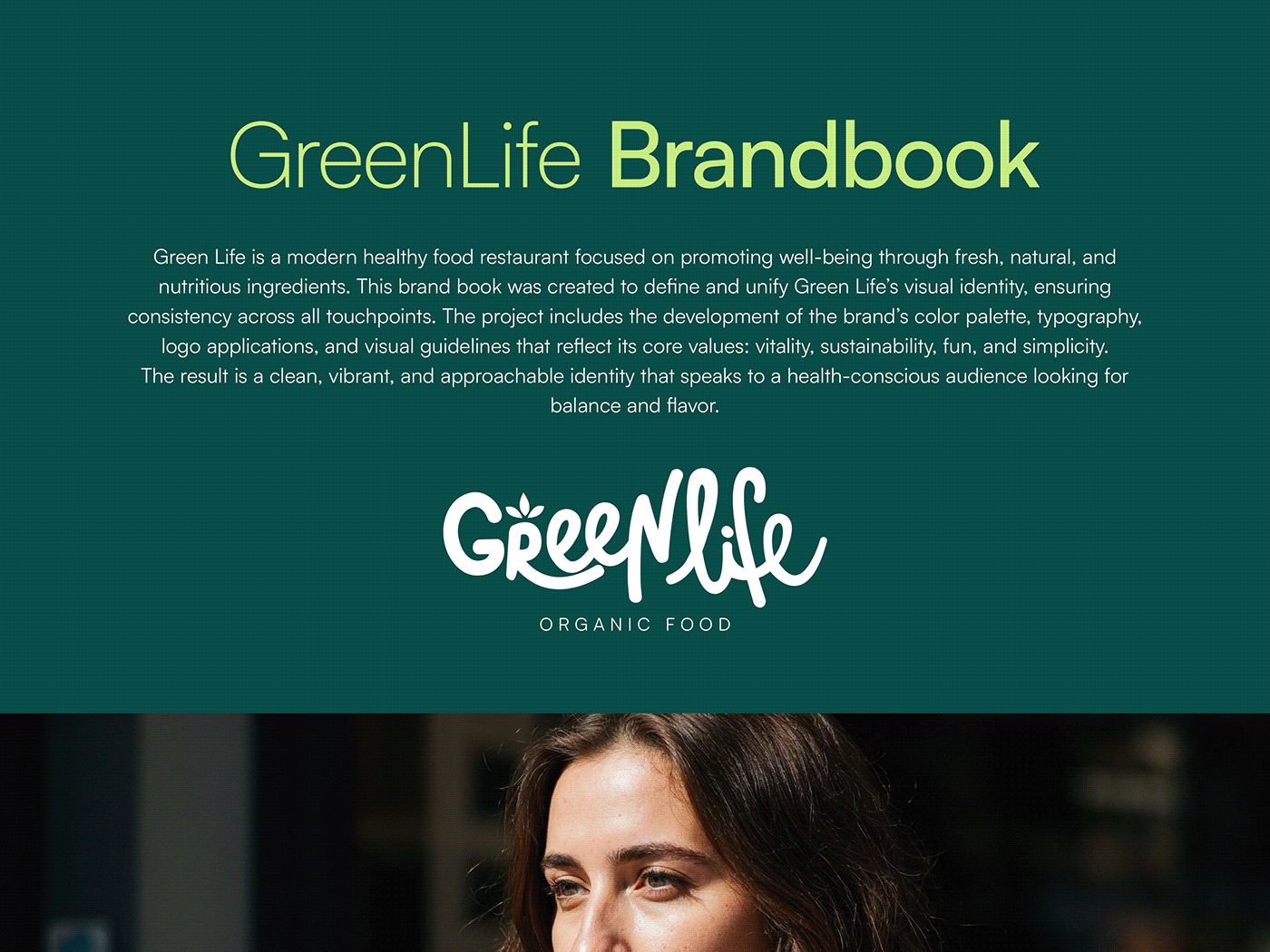
GreenLife is a healthy food restaurant focused on well-being through fresh, natural and nutritious ingredients.
I drew its logo by hand in 2017. In 2025 I came back to it: redrew the lettering and built the identity around it, from palette and type to photography.
The lettering
Drawn by hand, every curve.
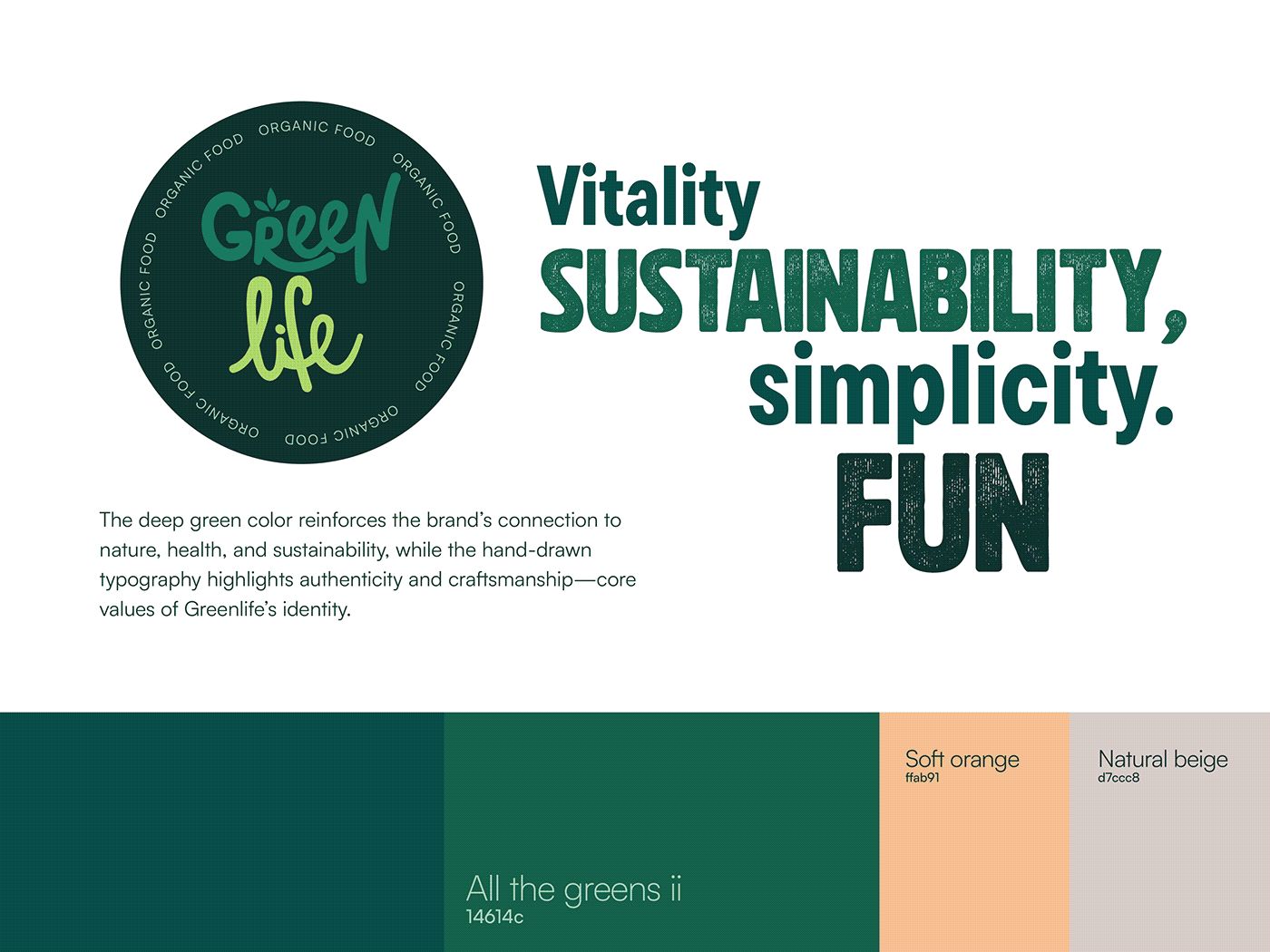
The logo was fully handcrafted to reflect the brand's natural, human essence. Smooth, organic curves and a playful flow bring the freshness of an organic lifestyle.
Four values
Vitality
[One line]
Sustainability
[One line]
Simplicity
[One line]
Fun
[One line]
Logo
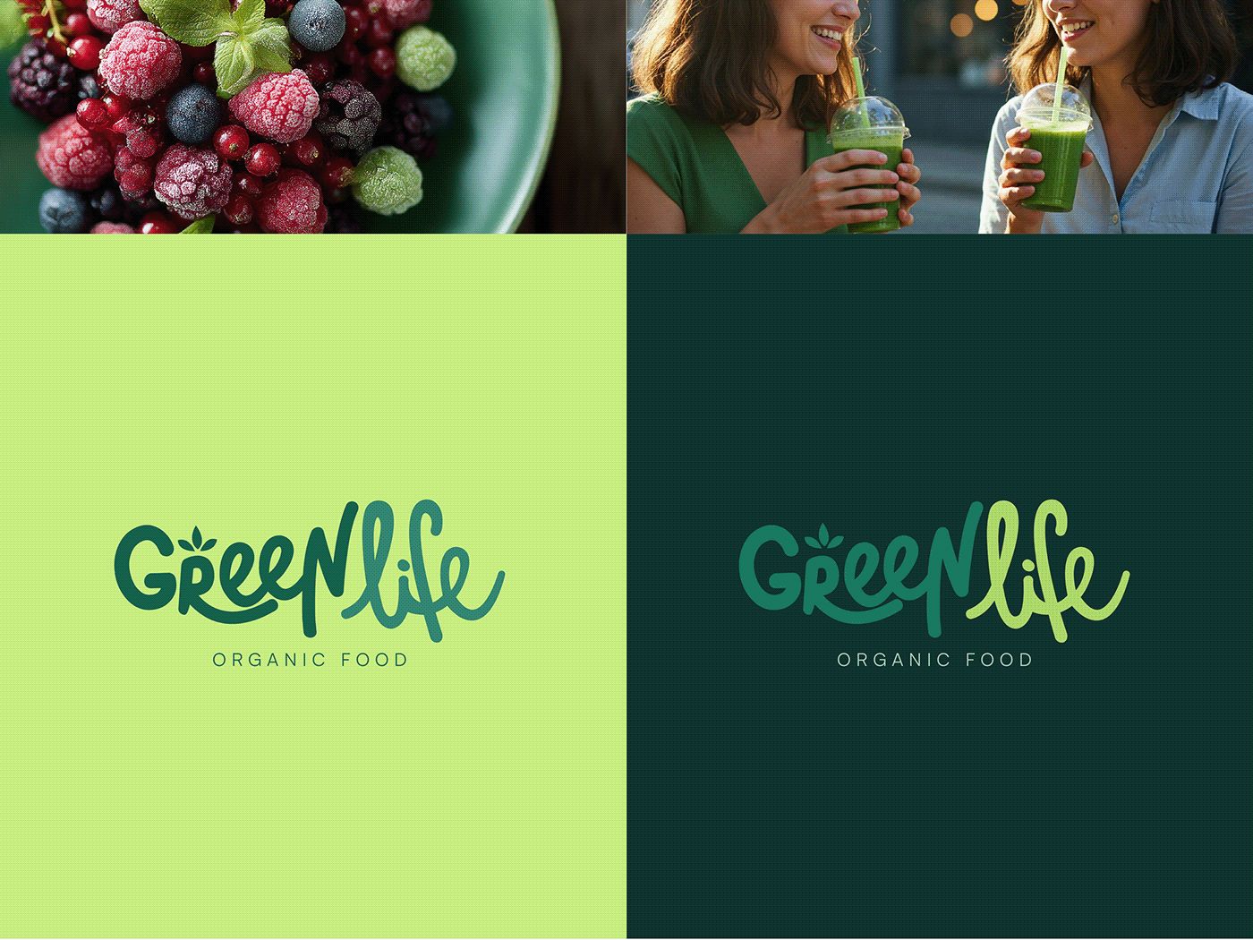
One word, two greens.
[One or two lines on the versions and where each one is used.]
Color
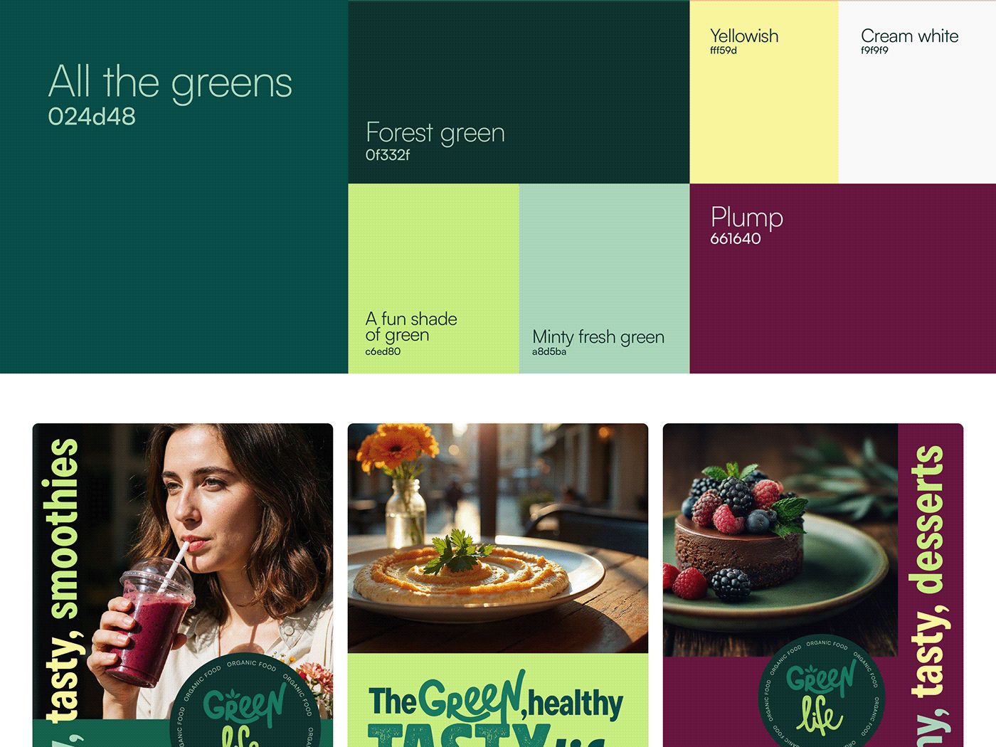
Ten colors, each with a name.
The deep greens tie the brand to nature, health and sustainability. Softer tones like orange, yellow and plump add contrast for food and campaigns.
Type
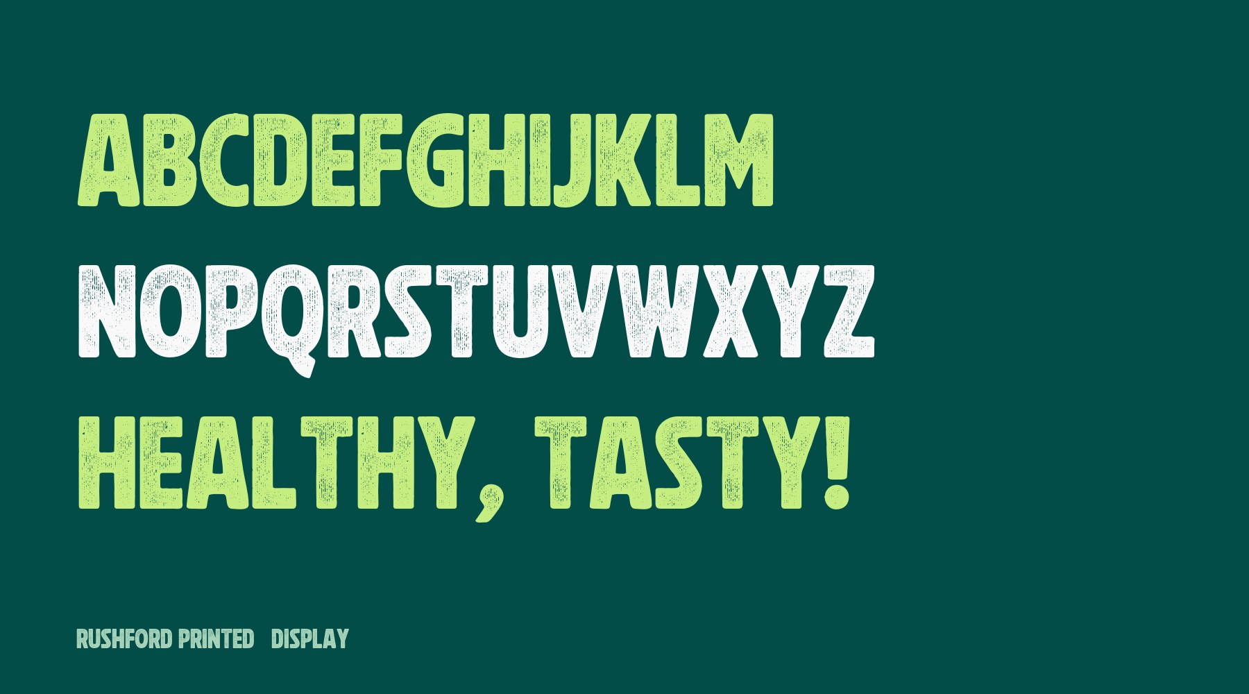
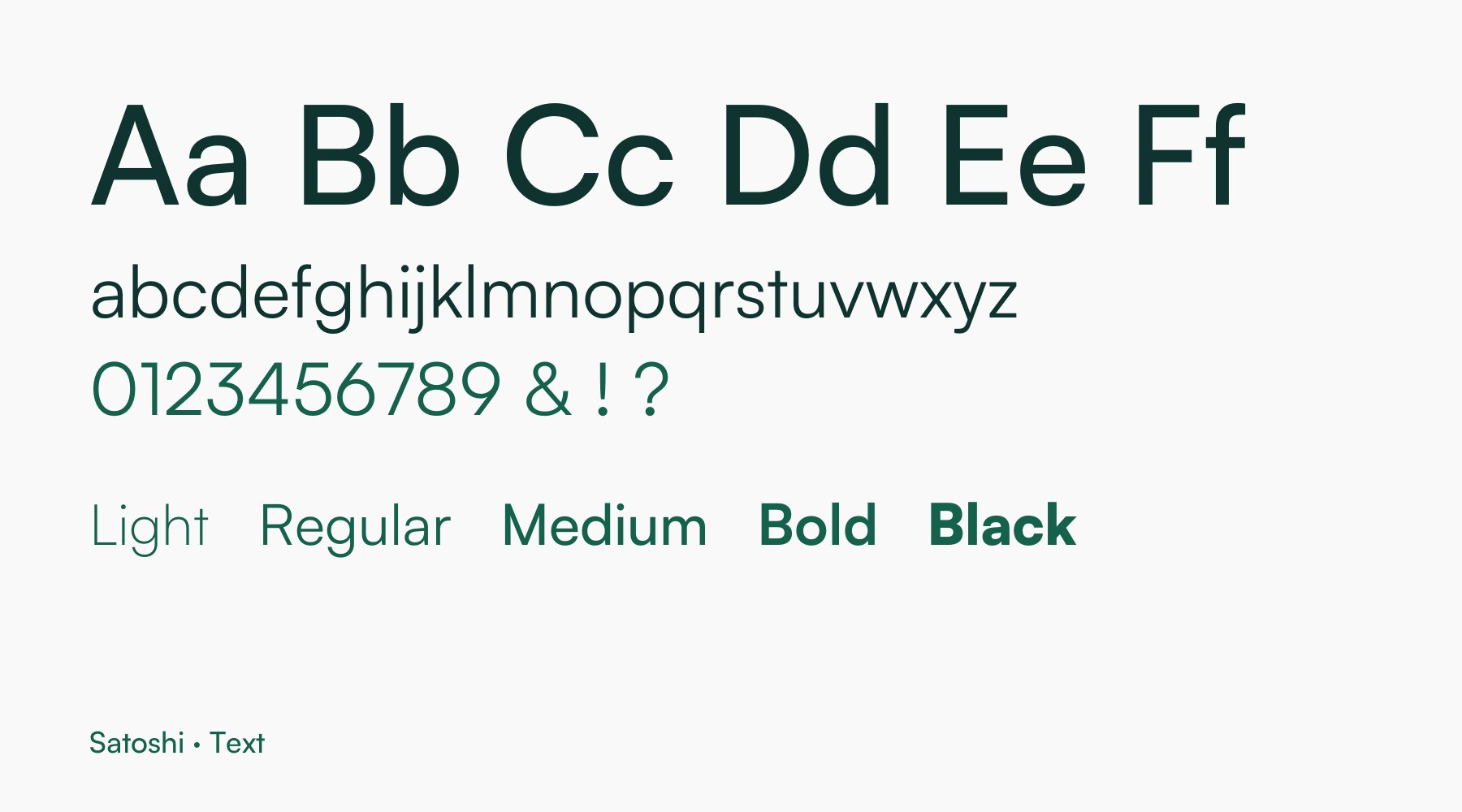
Texture for headlines, clarity for reading.
Rushford Printed gives headlines a printed, handmade feel that matches the lettering. Satoshi handles longer text.
Photography
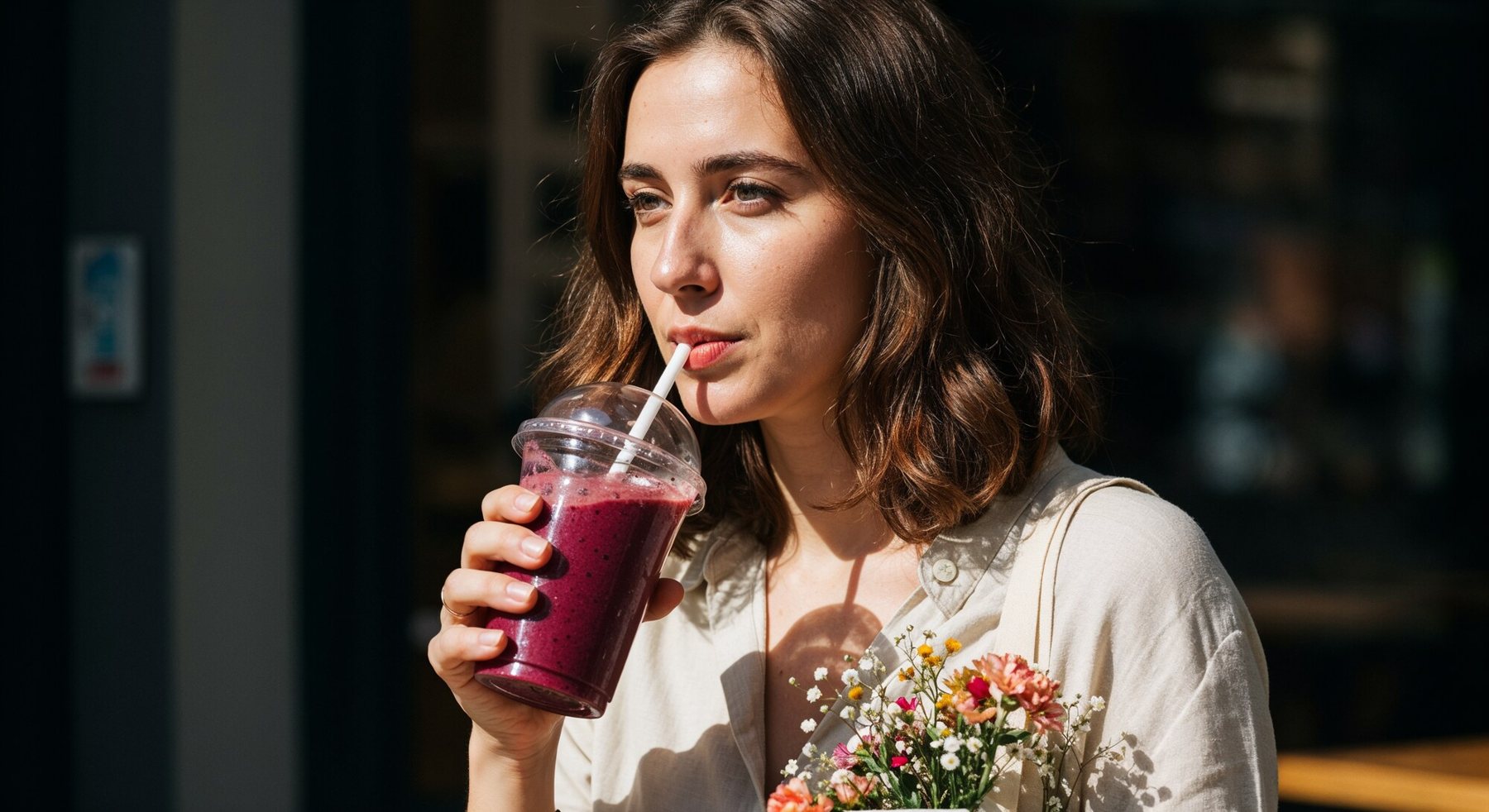
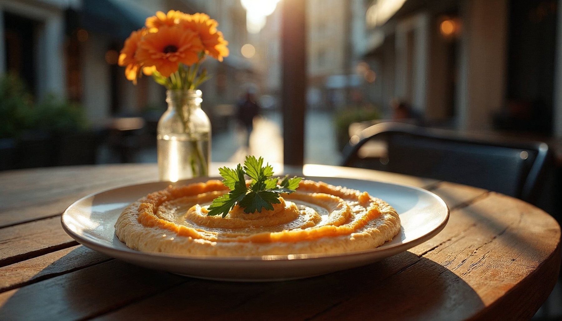
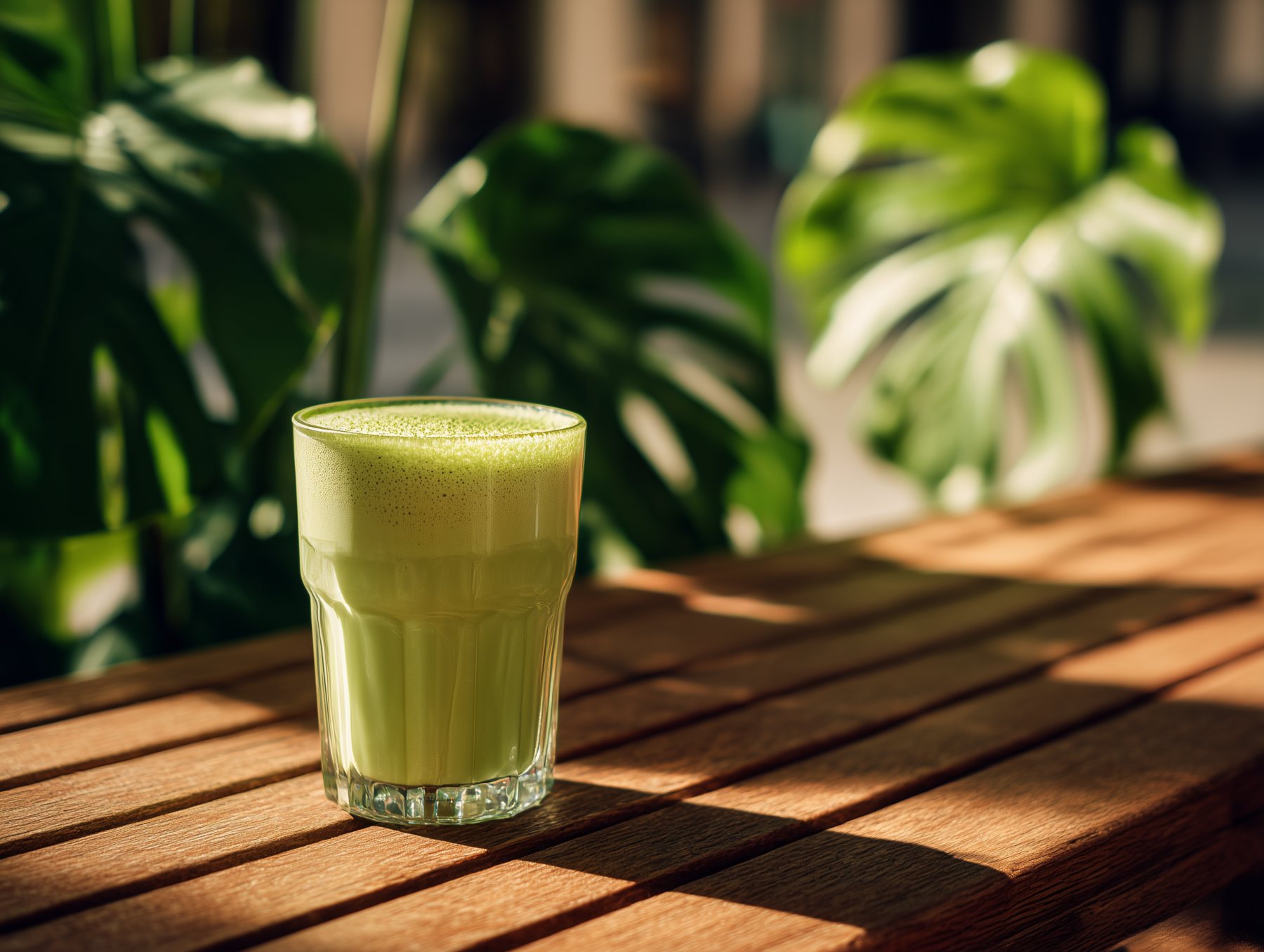
Candid, with natural textures.
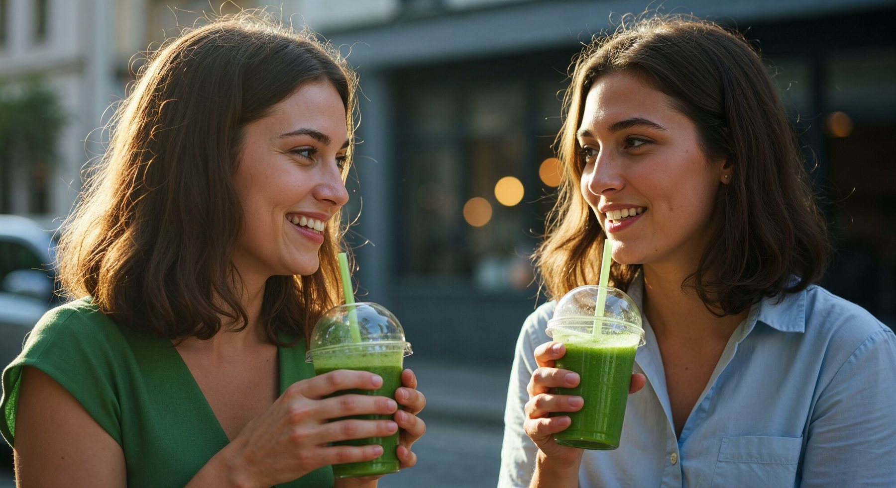
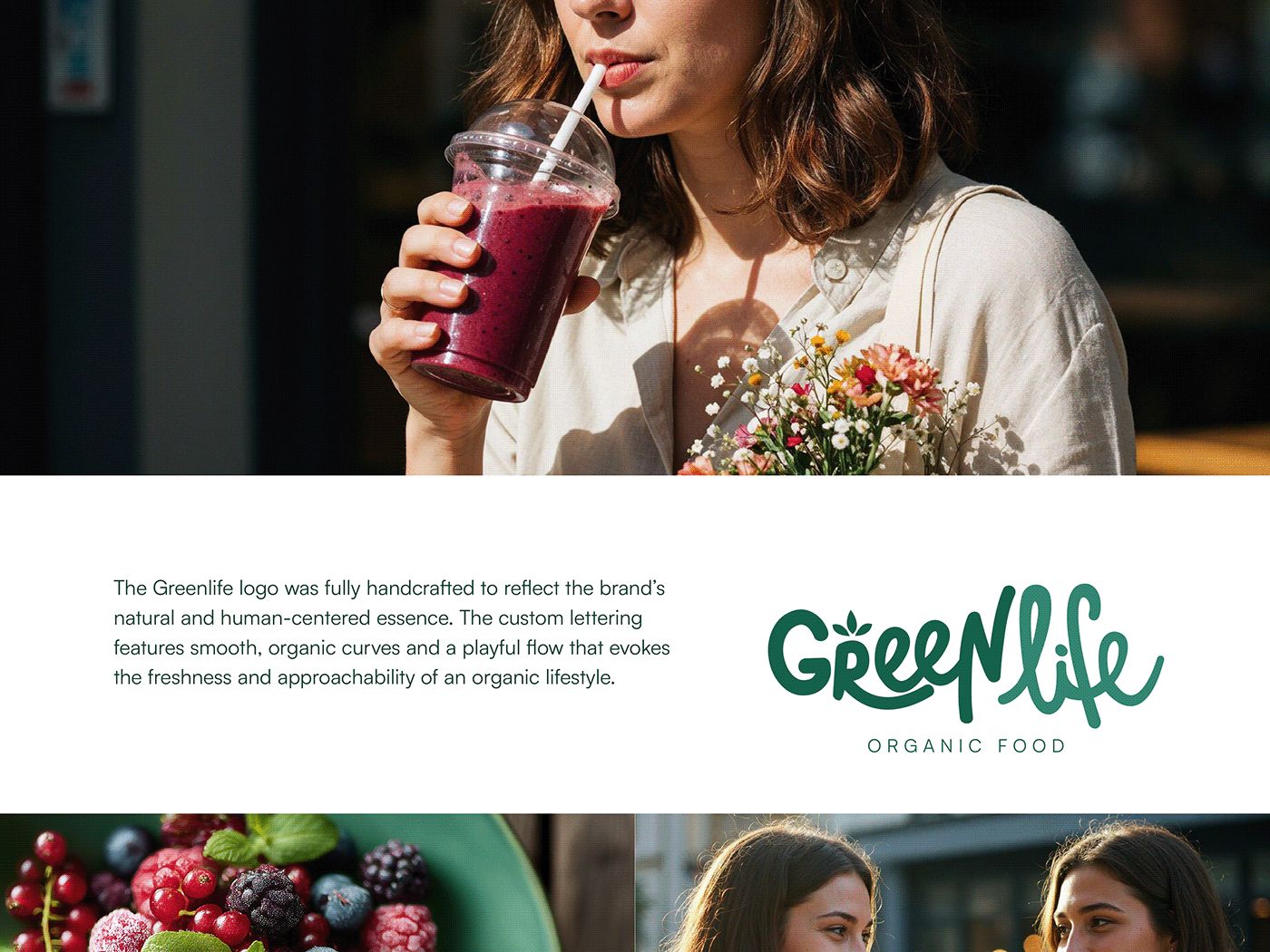
Candid images in warm, natural light, with the food and drinks always in the frame. All of them were generated with AI (Freepik and Midjourney) and art-directed to match the palette.
In use
[Title for the applications]
[Short line about the posters and where the brand shows up.]