Brand bookTwinnovate
Branding for a new business consultancy in Ecuador. The identity is built on two ideas, duality and innovation: paired elements in balance and clean, modular geometry. The brand book keeps it consistent across every touchpoint.
- Year2025
- RoleFreelance Brand Designer
- ClientBusiness consultancy, Ecuador
- ScopeLogo, visual identity, brand book
The brief
[Main line for the brief]
Twinnovate is a new business consultancy in Ecuador. It needed a complete identity, from the logo to the rules that hold it together.
The system had to be scalable, adaptable and consistent across digital and physical touchpoints. The brand book sets how to use it: logo, color palettes, grids and type.
The idea
Two forces, one brand.
The name holds the idea: twin + innovate. Every part of the identity is built on those two axes.
Duality
Paired elements in balance, showing the synergy between two complementary forces.
Innovation
Clean geometric shapes, contemporary type and modular compositions that feel flexible and future-facing.
Logo
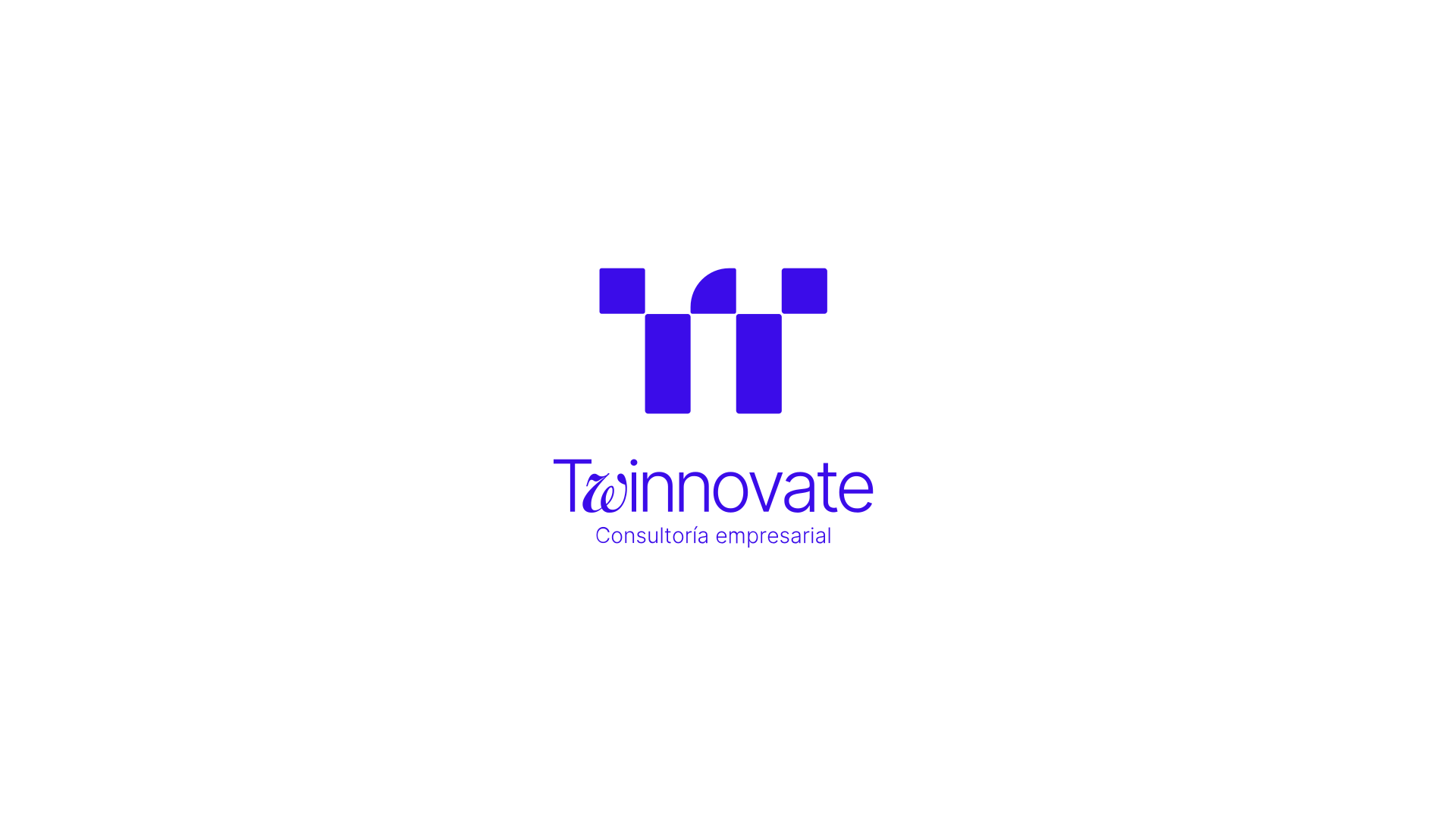
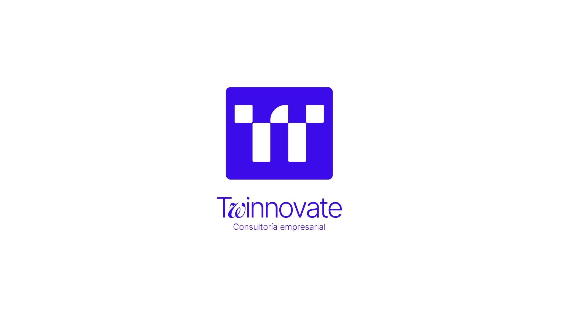
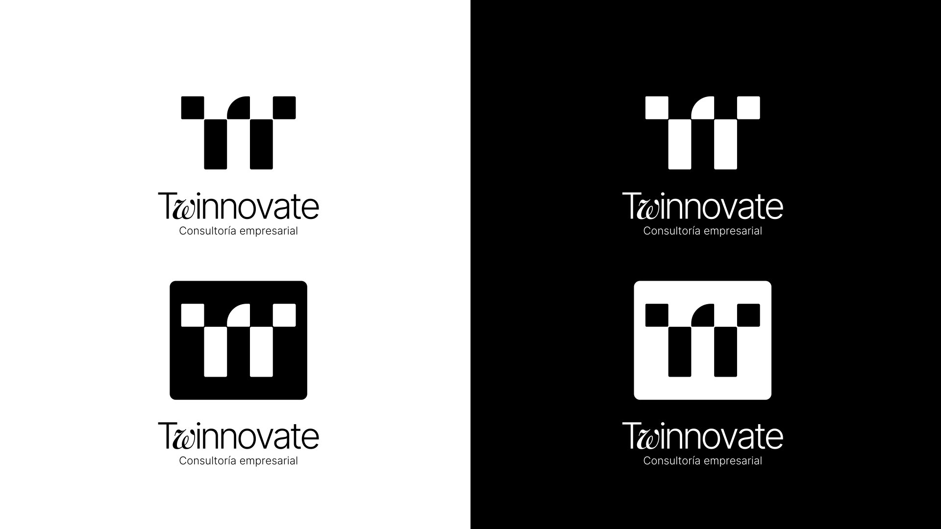
A mark made of pairs.
[One or two lines on how the symbol is built and when to use each version.]

Color
Electric blue, warm coral.
[Short line on the palette and how the colors work together.]

Look & feel
A modular pattern that can grow.
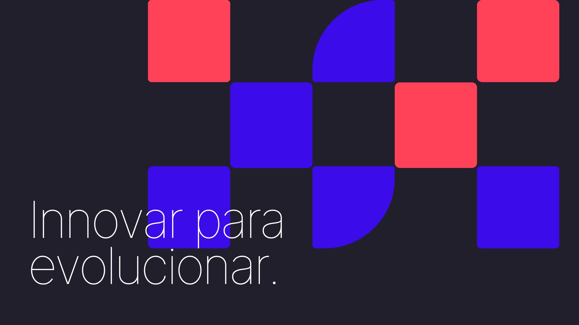
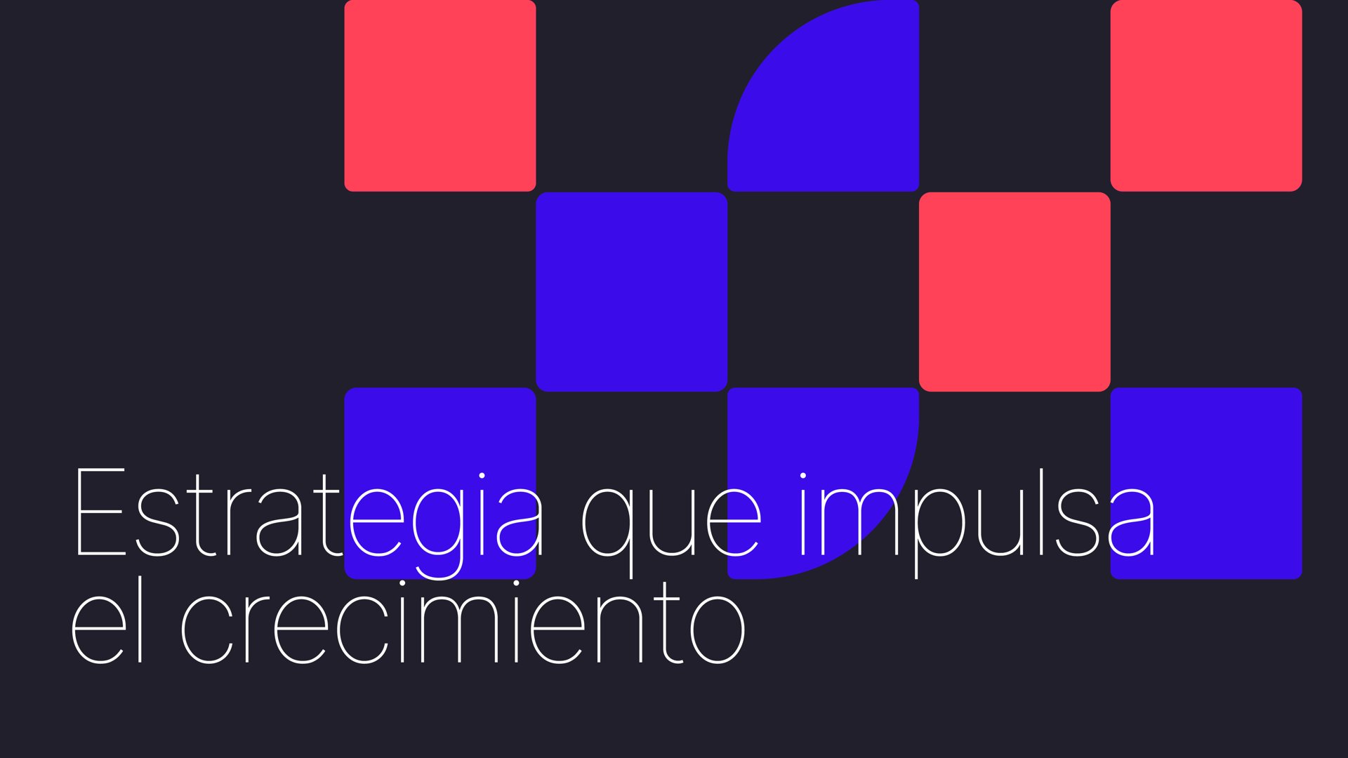
The squares and quarter circles of the symbol become a pattern for covers, slides and social, always with a short line of copy.
Applications
[Title for the applications]
[Short line about where the brand shows up.]