Brand systemKeyword
The firm's identity, rebuilt as a documented system. The brand manual lives as a website, so anyone on the team can make on-brand work without waiting on design.
- Year2018 – Present
- RoleDesign Director
- WhereEcuador & Mexico
- ScopeIdentity, brand system, product naming, brand book website

The starting point
Nobody asked for it. The brand was scattered, so I asked for the budget and started building it.
Keyword is a public affairs and strategic communications consultancy in Ecuador and Mexico. Its products, from the annual Key Especial report to employment figures and sector reports, reach 100+ executives.
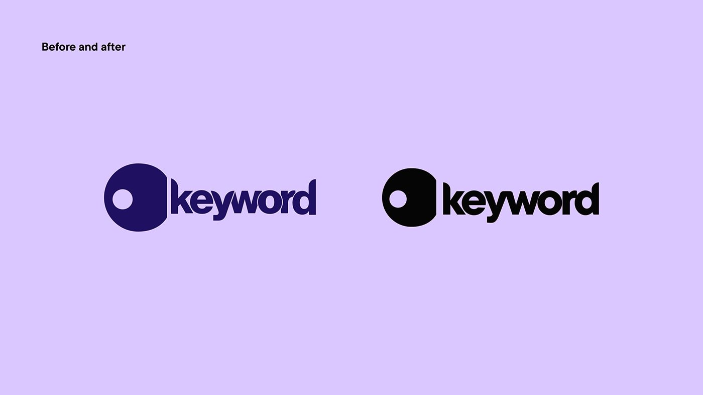
[Two or three lines on what the brand looked like before and what wasn't working.]
The system
Three elements, one idea: there's always more.
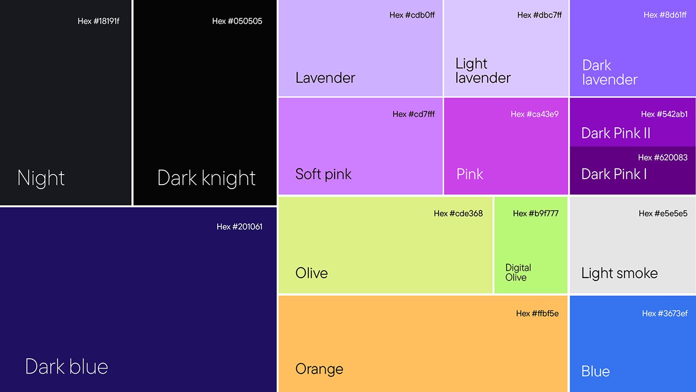
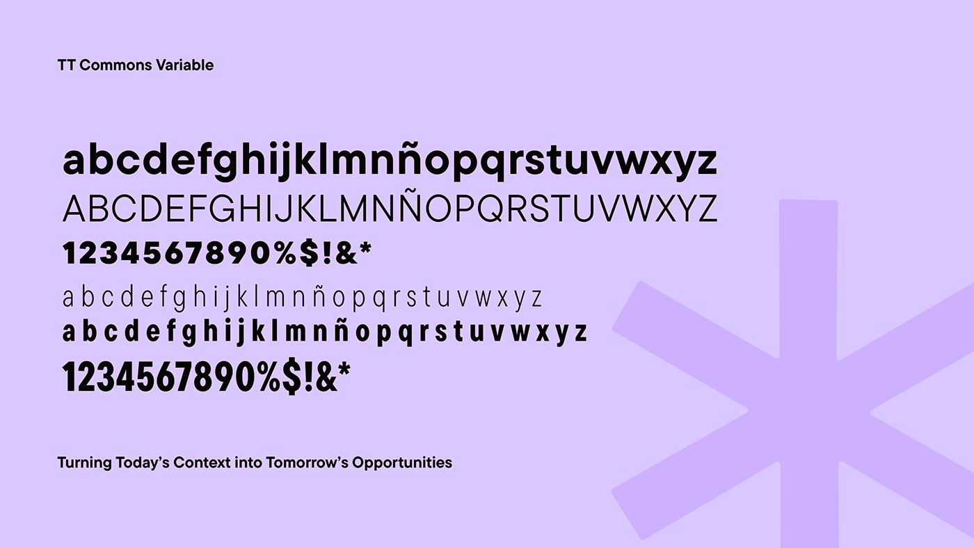
The 360° service is translated into three basic elements. Together with the palette and type, they let the brand flex across reports, decks, social and events without losing itself.
- (01)
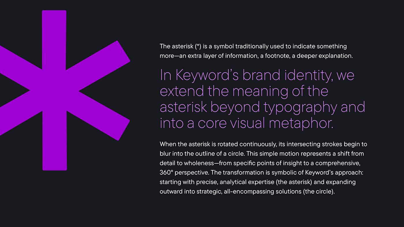
The asterisk
A symbol that signals there's more: a footnote, a deeper layer of information. Rotated, it blurs into a circle.
- (02)
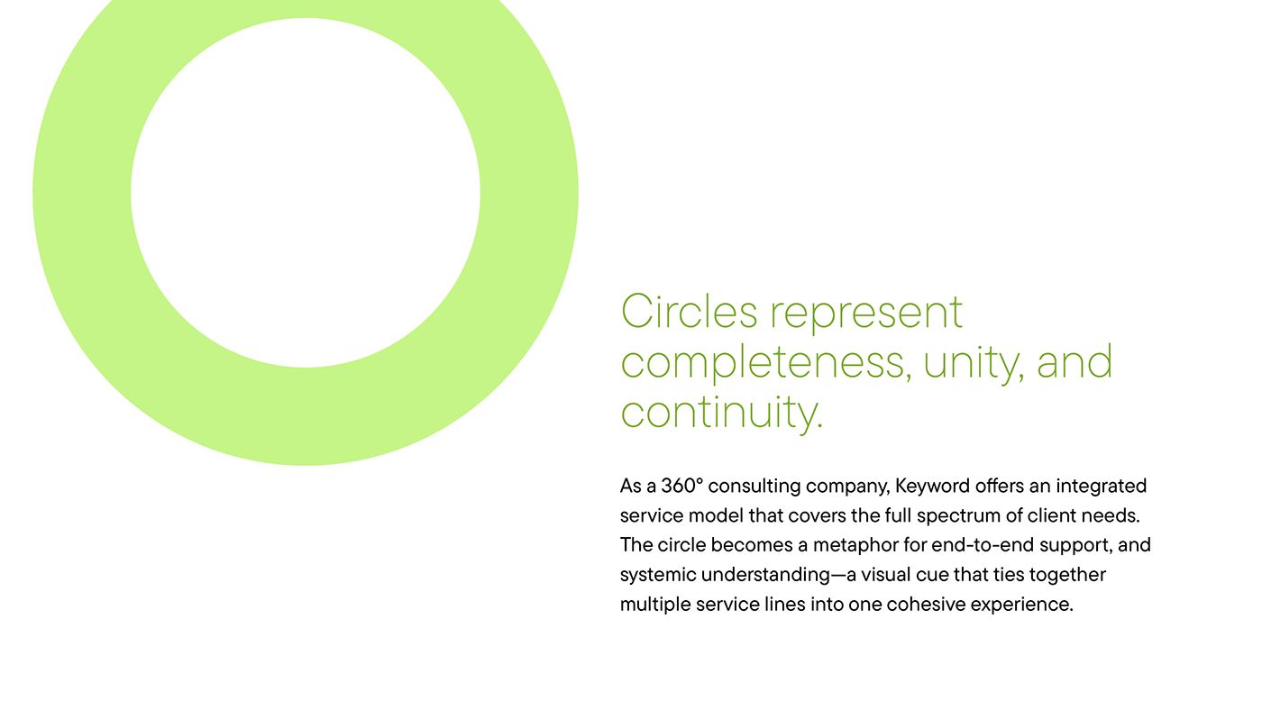
The circle
Completeness and continuity: the full spectrum of client needs in one service.
- (03)
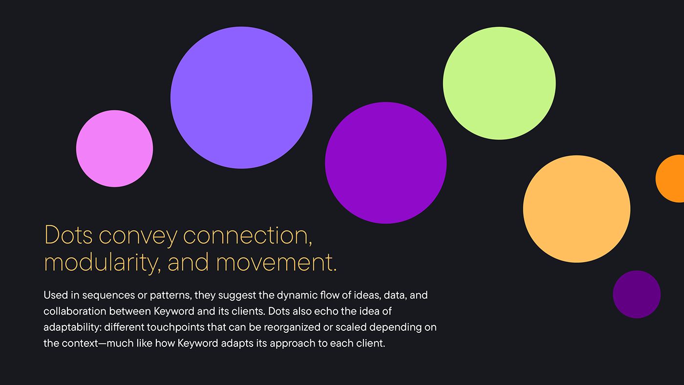
The dots
Connection, modularity and movement. They show how data and ideas flow.
Product family
key + topic.
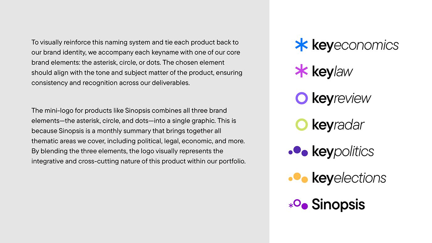
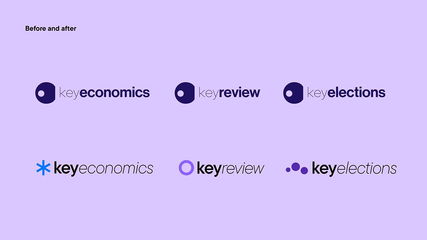
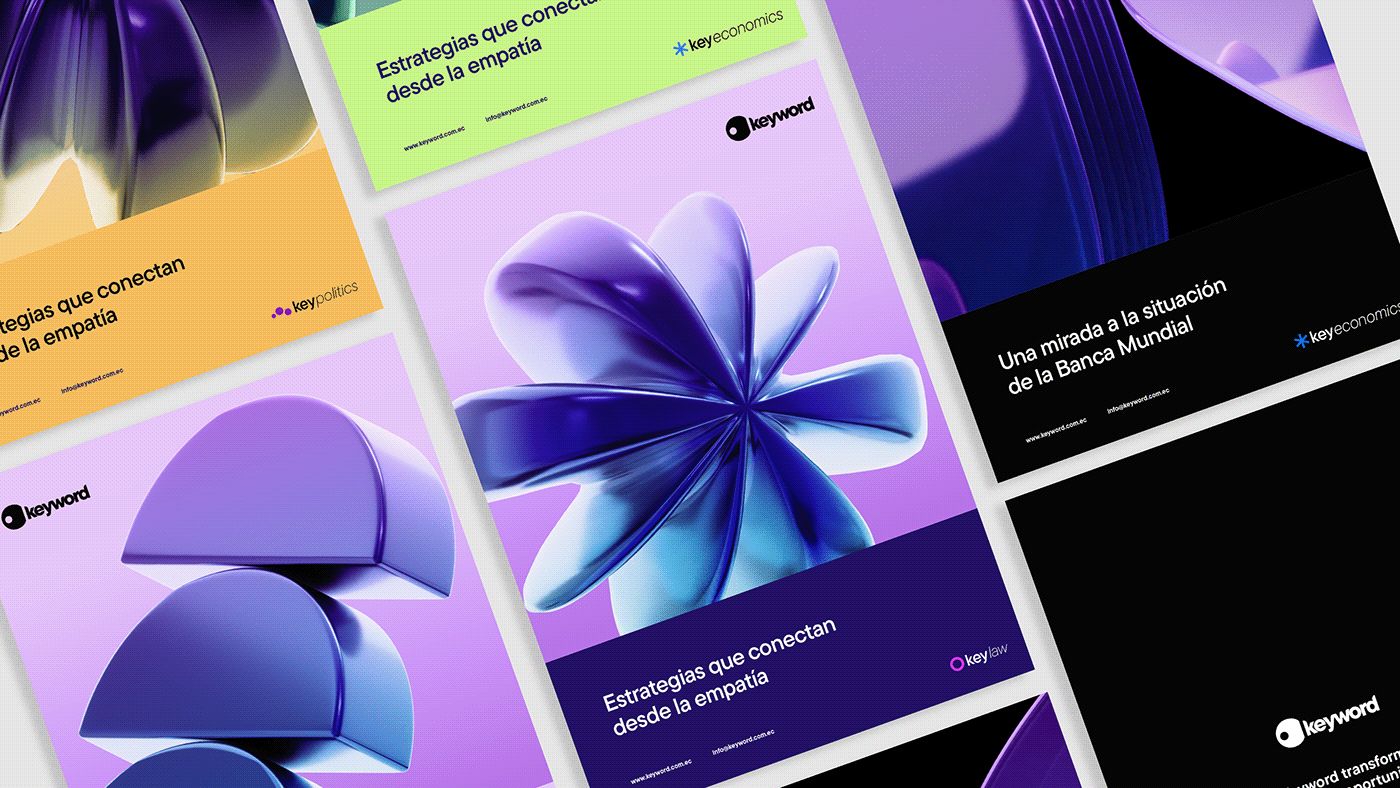
Every information product follows one naming rule: the prefix "key" plus the topic. keyeconomics, keylaw, keyreview, keyelections. Each one carries an element of the brand, so a growing family still reads as Keyword.
The brand book
A manual people actually open.
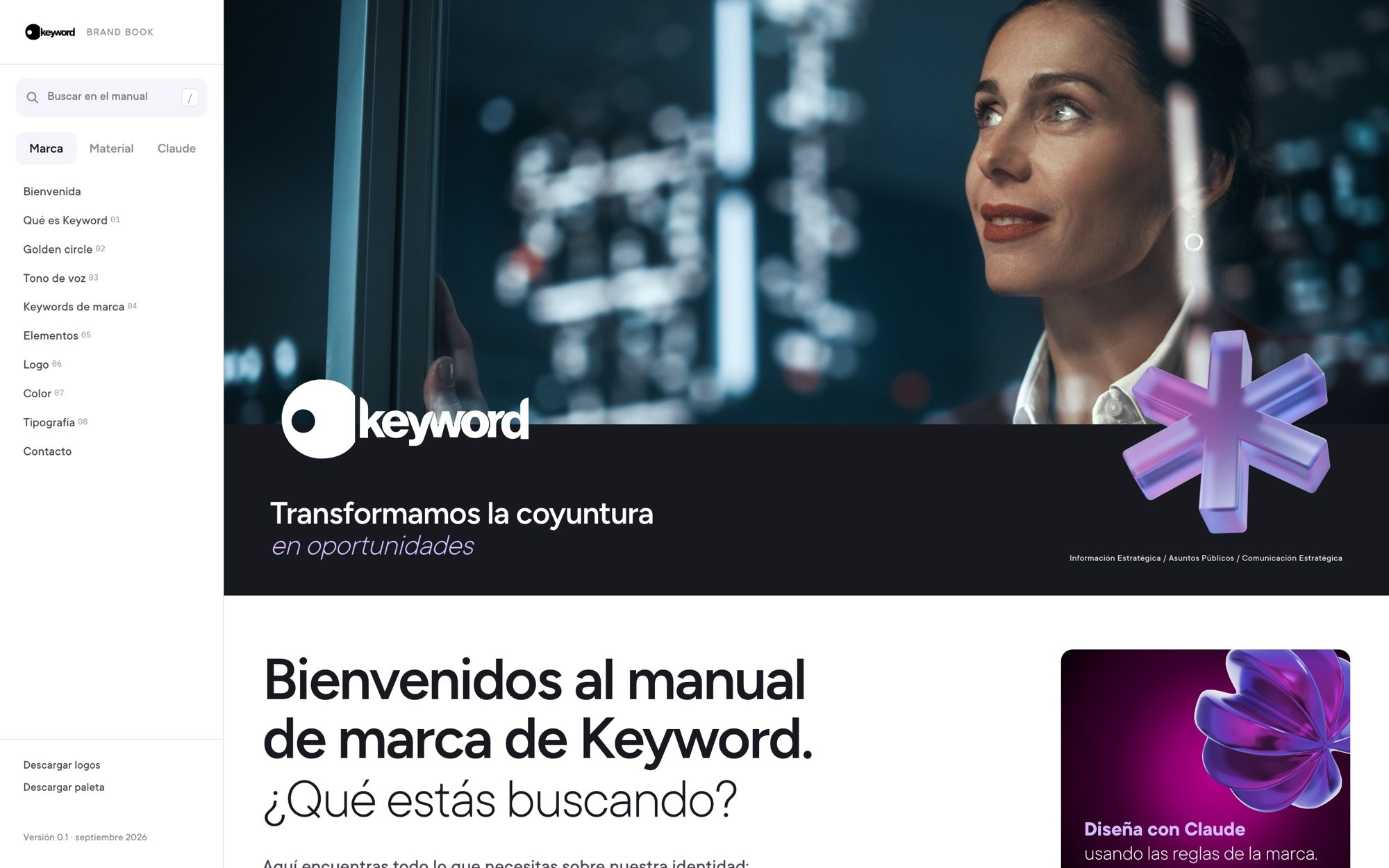
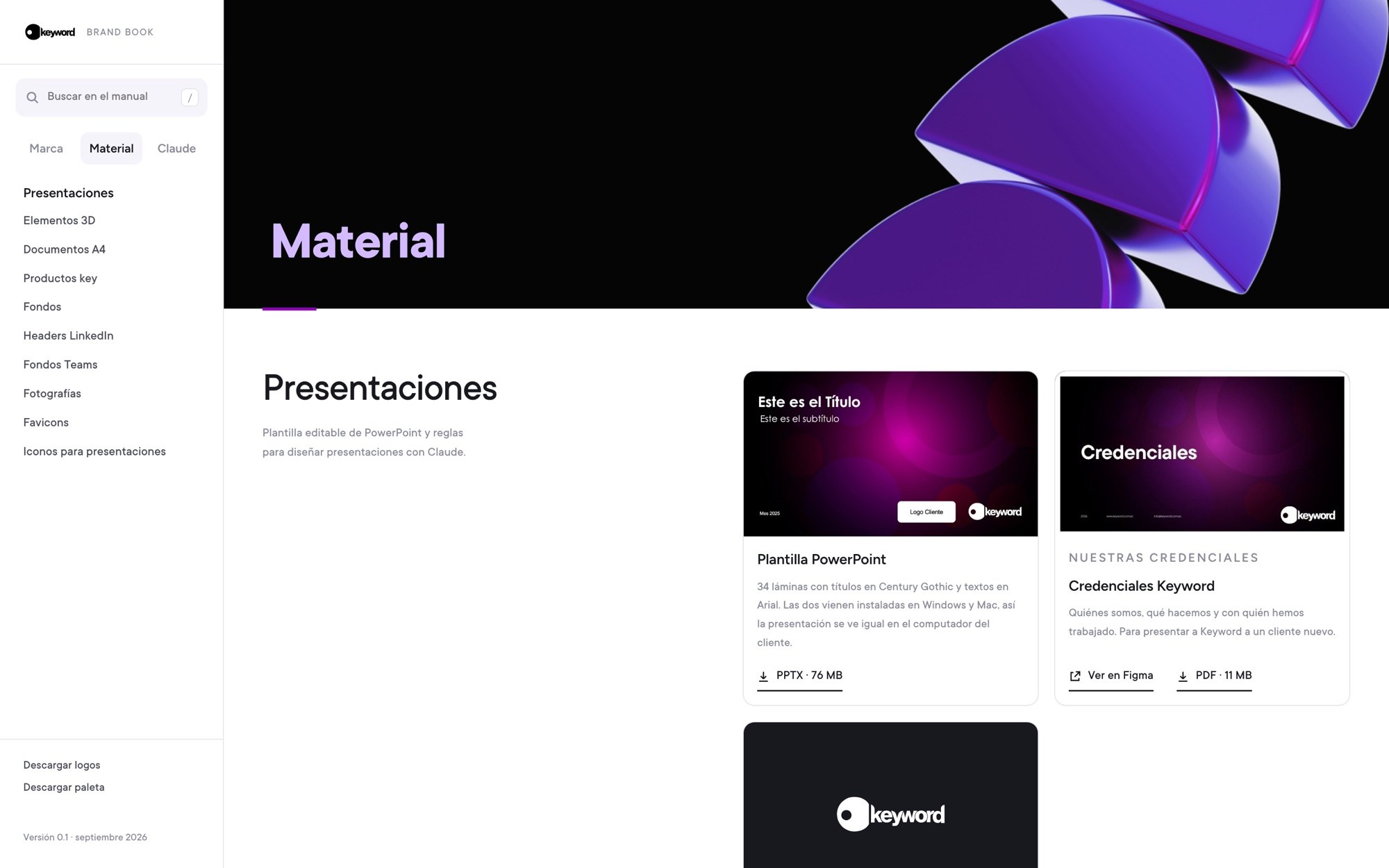
Instead of a PDF nobody reads, the brand lives as a website with search. Anyone at the firm can download logos, templates and assets, and check the rules before they design.
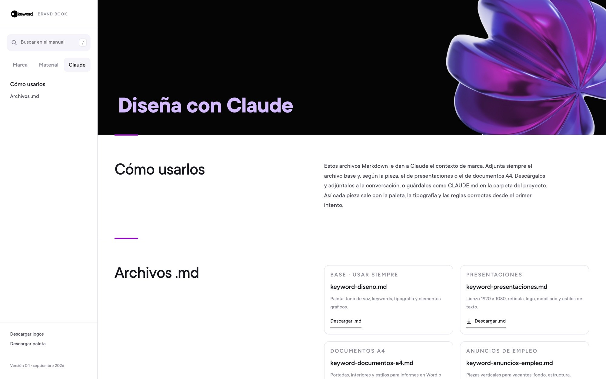
It also has a section to design with Claude: context files with the palette, tone and layout rules, so every piece comes out on brand from the first try.
Brand
What Keyword is, golden circle, tone of voice, elements, logo, color and type.
Material
Decks, A4 documents, product logos, backgrounds, LinkedIn headers, Teams and photos.
Claude
Markdown files that give Claude the brand context for decks, documents and job posts.
In use
[Title for the applications]
[Short line about where the system shows up: reports, decks, social, events.]
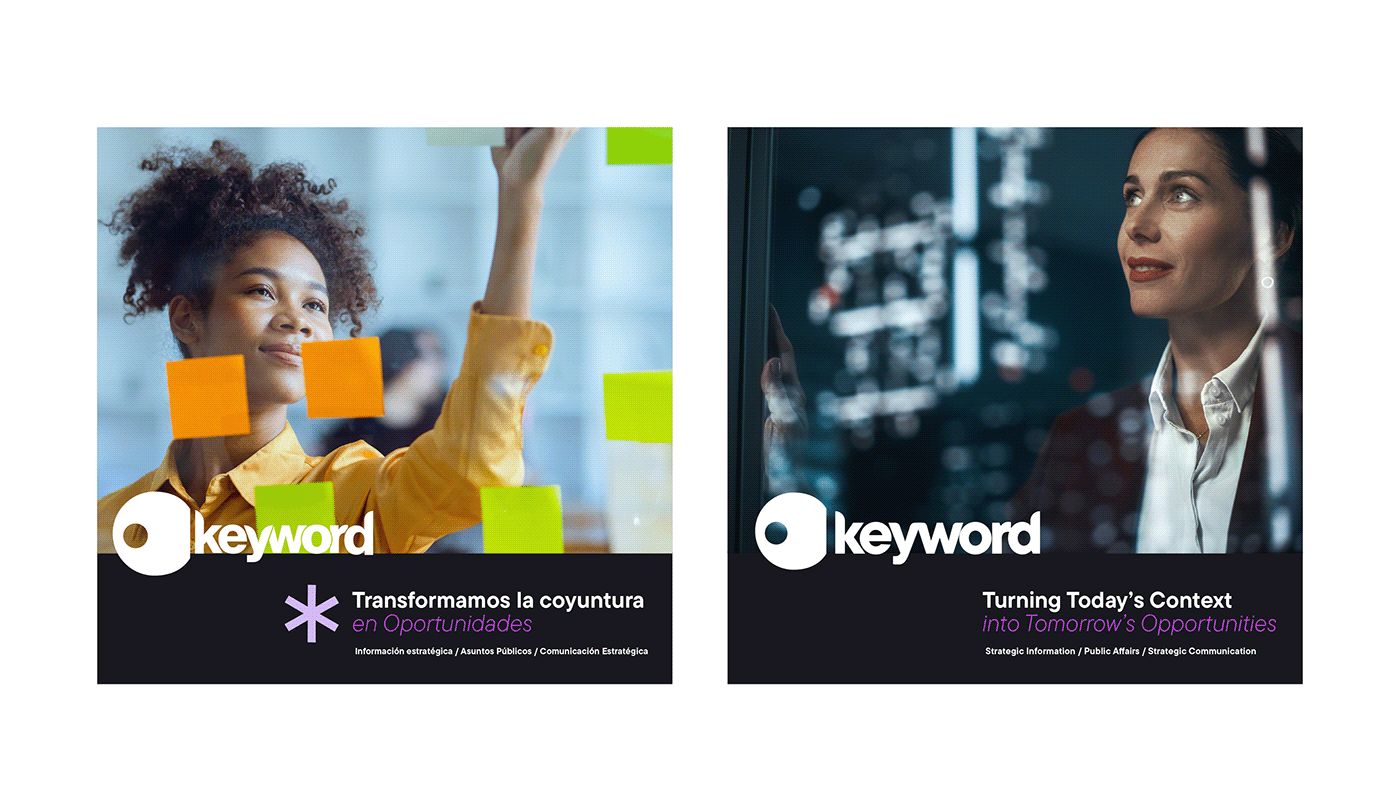
← add more applications: decks, events, Key Especial