Art directionEcuador Chocolate Project
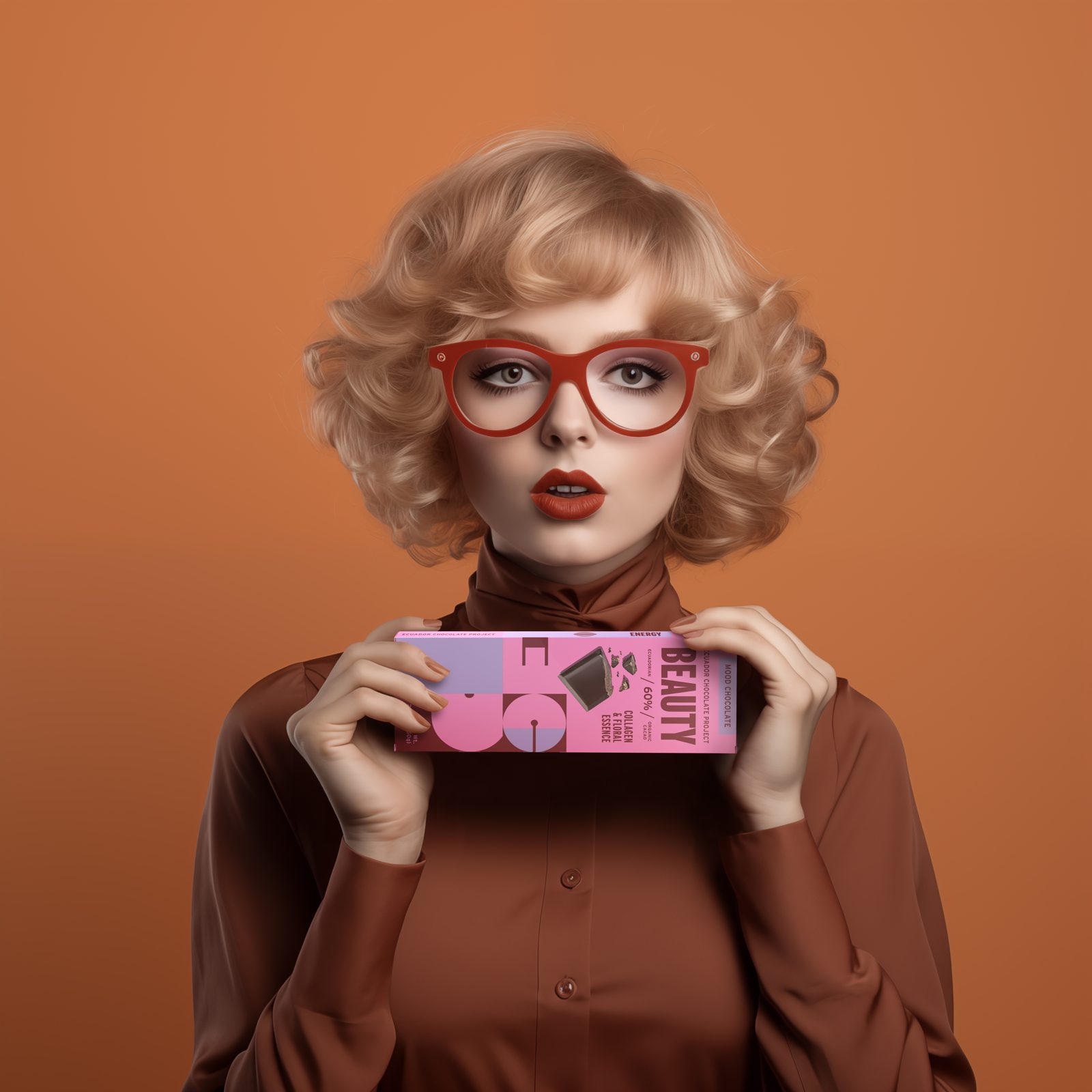
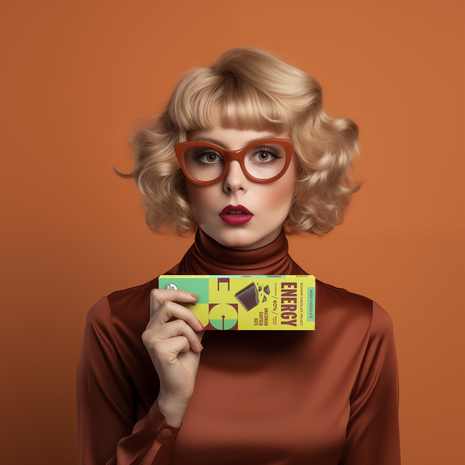
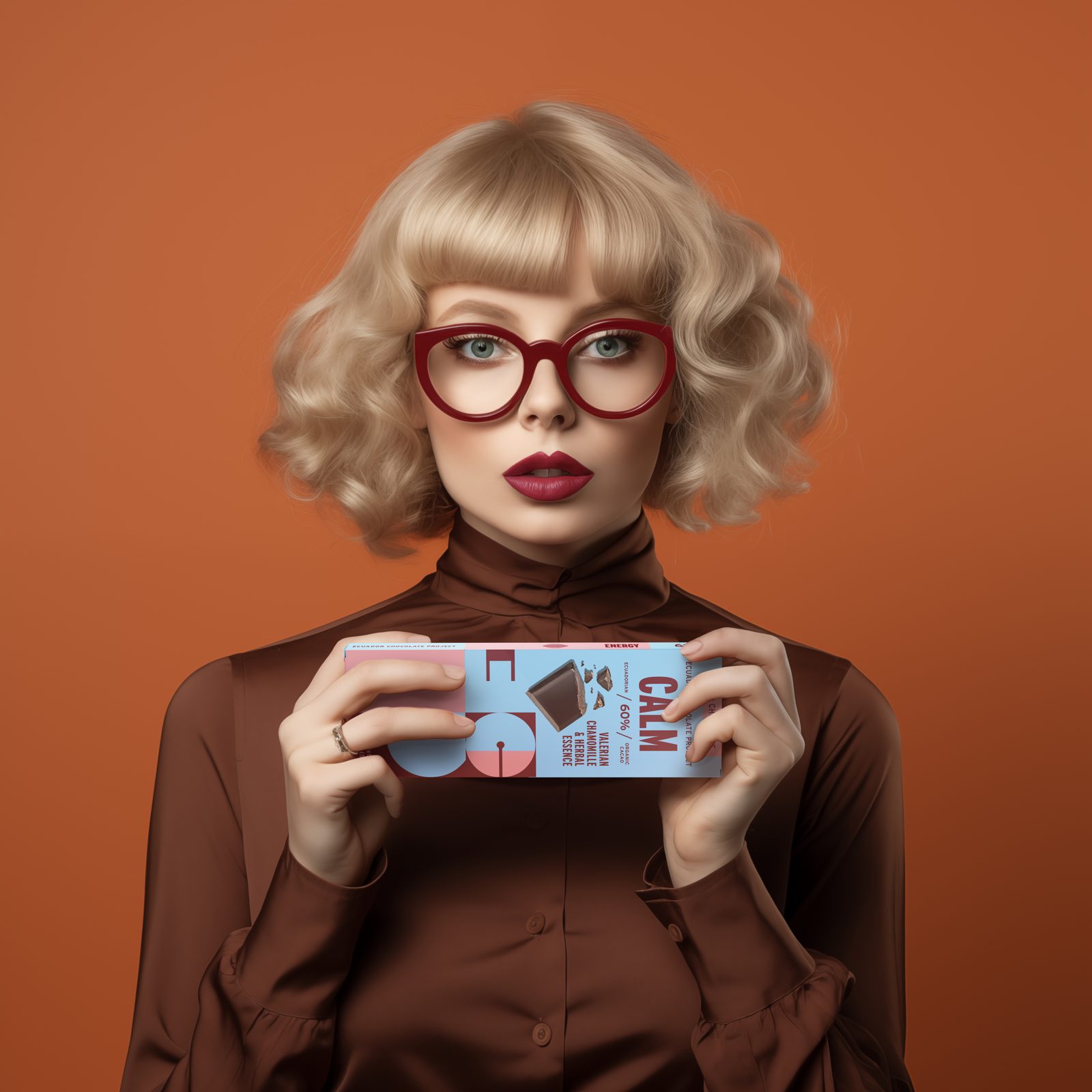
Art direction for a new chocolate brand entering the market. We built its visual identity, an image world built with AI and retouching, and the way it speaks, so the brand launched with a look and tone of its own.
- Year2023 – 2024
- RoleArt Director
- ChannelInstagram
- ScopeCreative concept, visual identity, AI imagery and retouching, voice
The brief
Introduce a new chocolate brand on social media, starting in the first quarter of 2024.
The brand needed a way into a market that already had plenty of chocolate. The goal was to find a visual and conceptual difference: use humor, and even the absurd, to spark interest while staying true to the brand's values.
All of it through an avant-garde look that feels nostalgic but still current.
Must-haves Premium quality, the ingredients of each bar and the brand's personality.
The idea
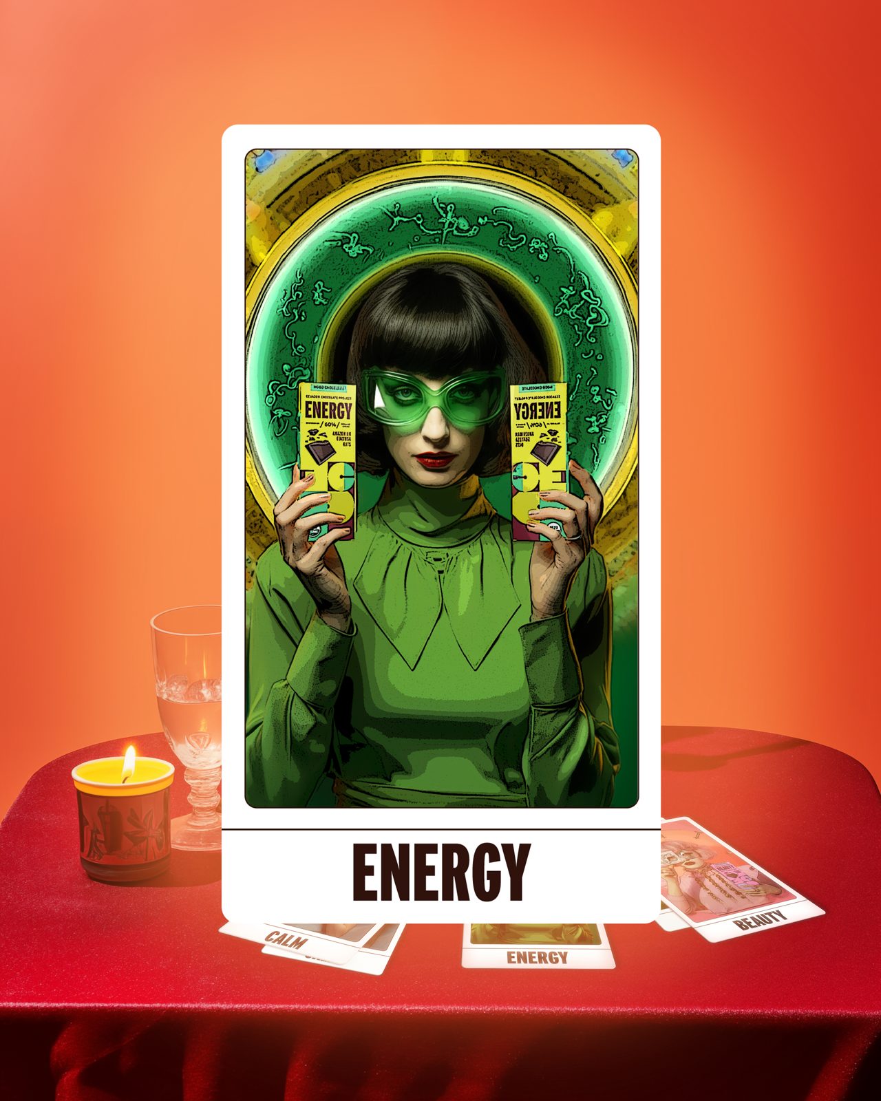
In the mood for… ChocolateBeautyCalmEnergy
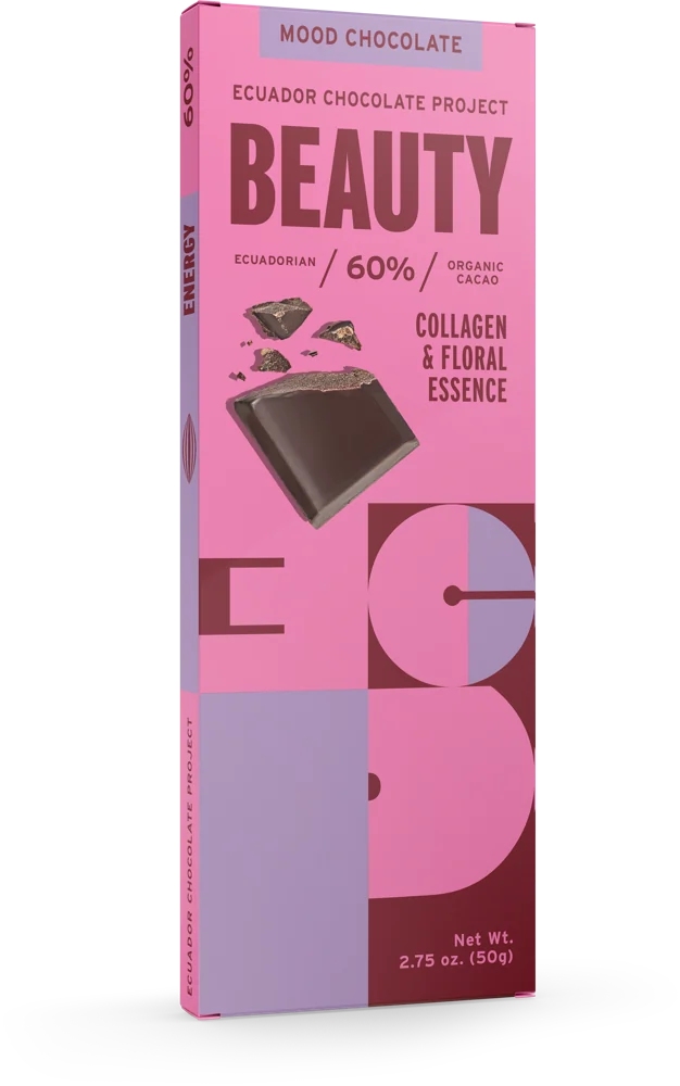
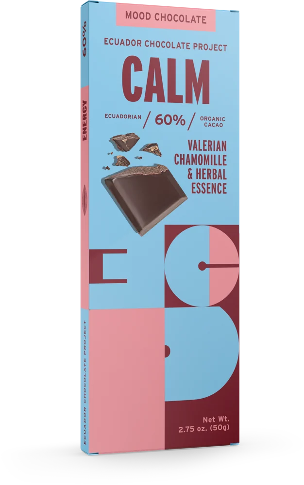
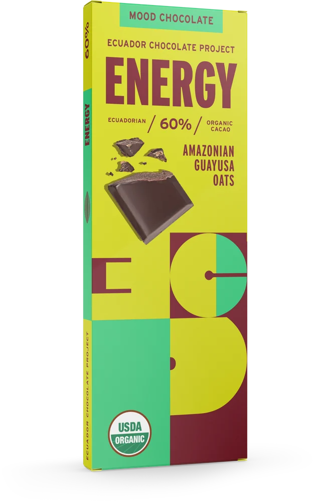
"In the Mood For…" invites people to pick their chocolate by how they feel. Each bar becomes a mood, and the line stretches to any flavor, launch or season.
Keywords
- Irony
- Fun
- Premium
Teaser
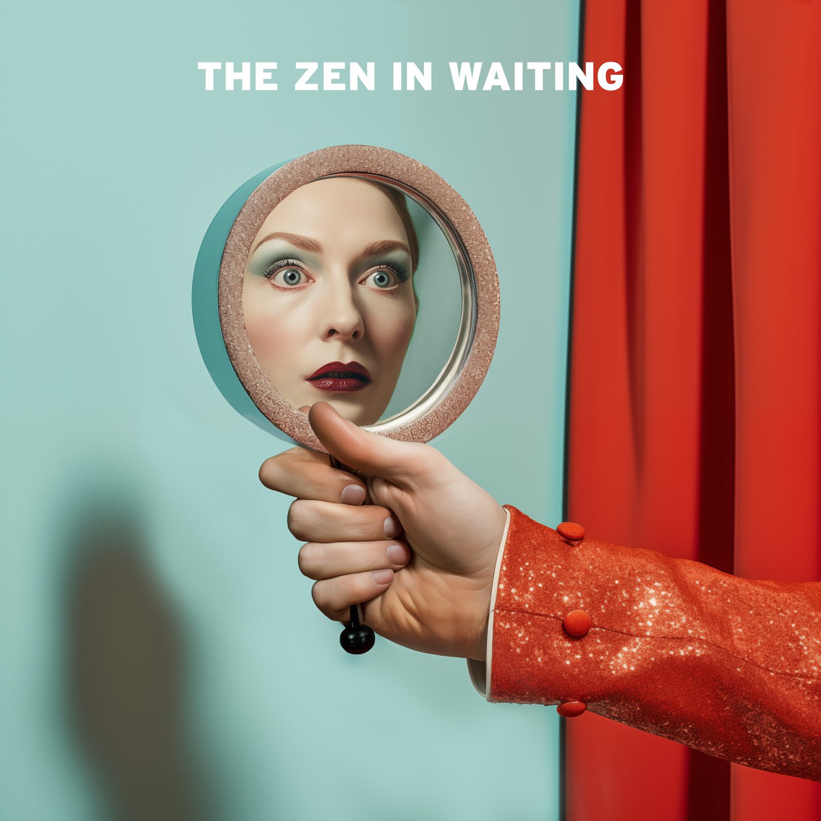
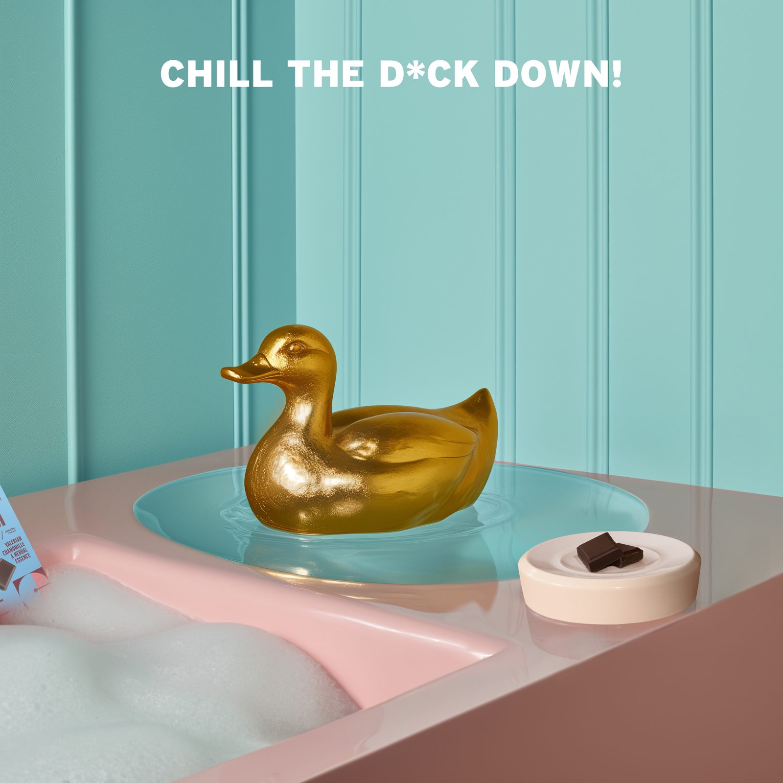
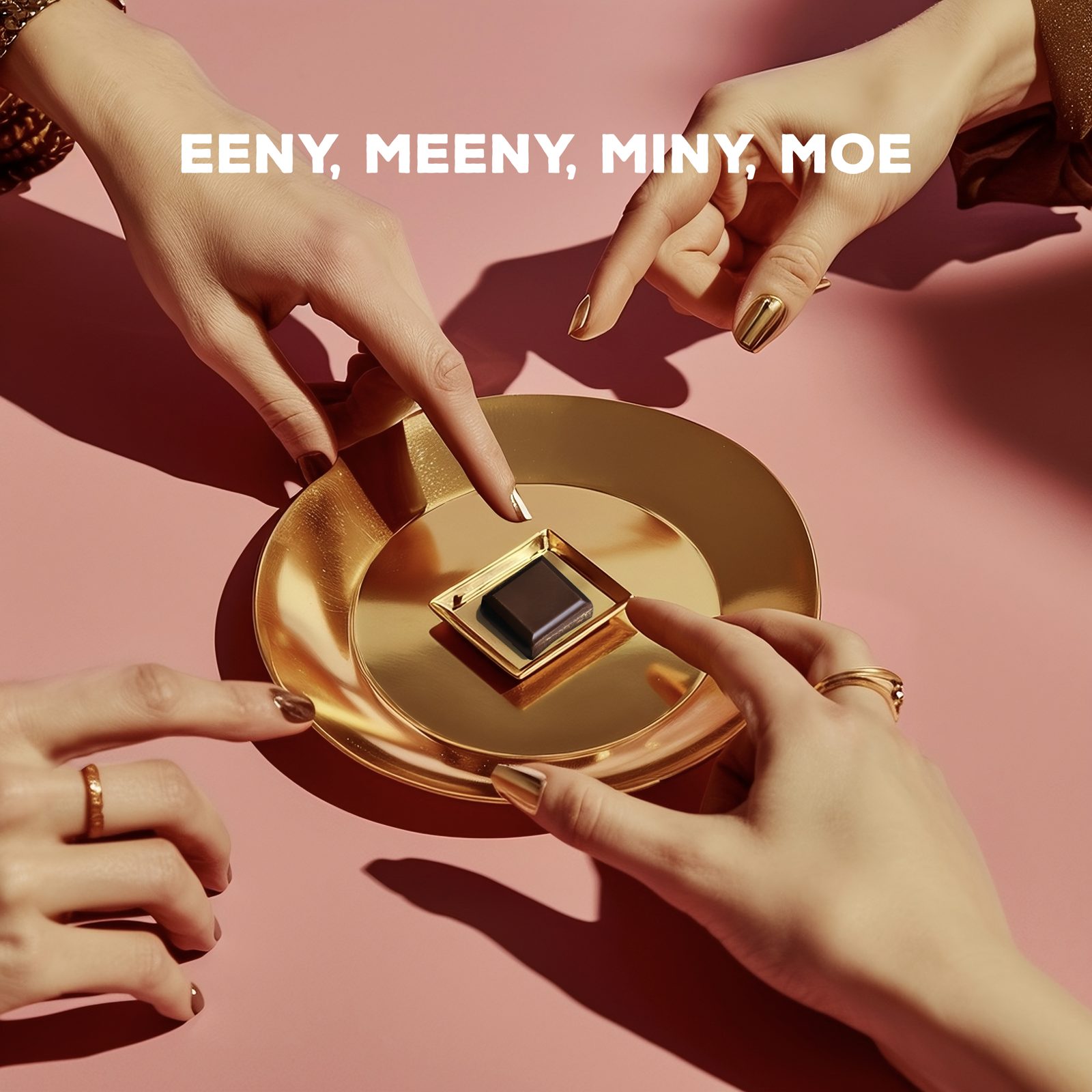
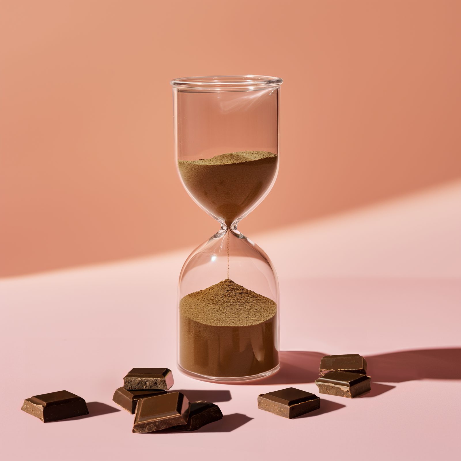
Before the launch, a little impatience.
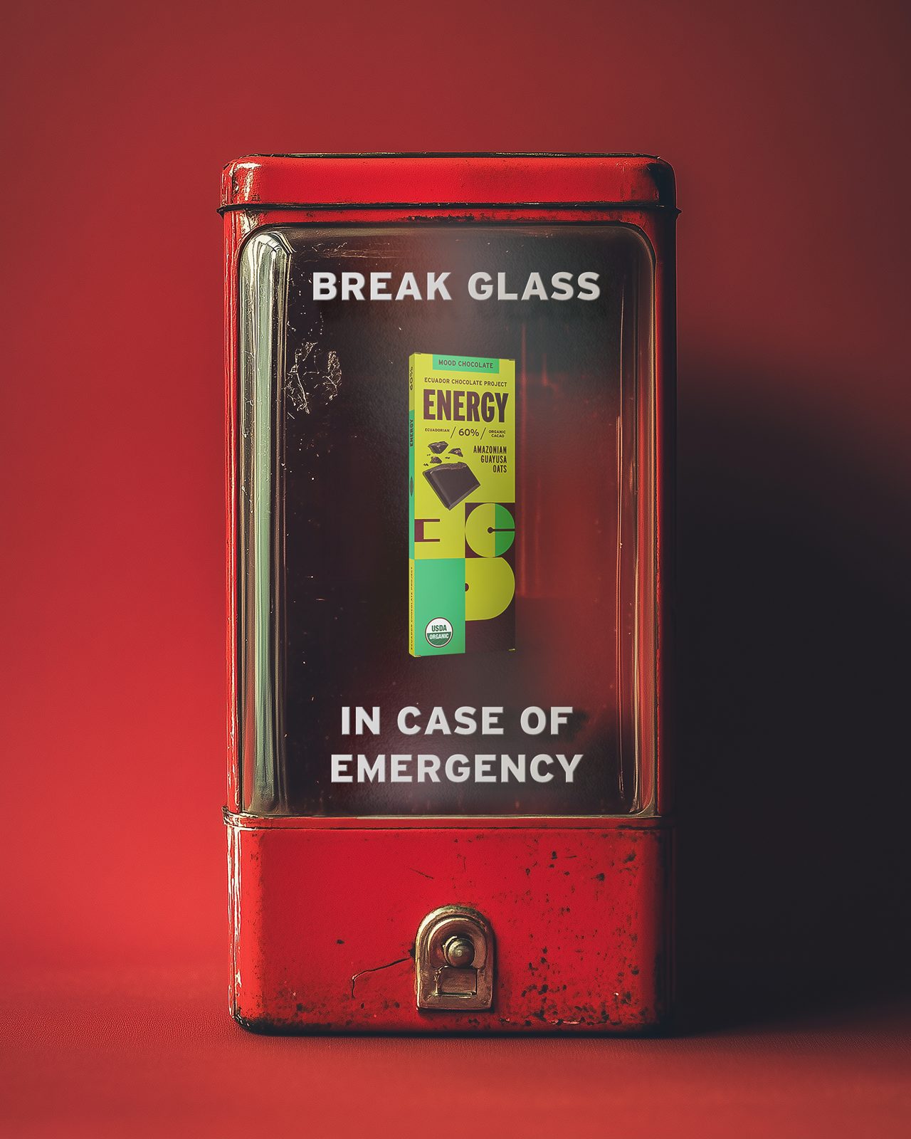
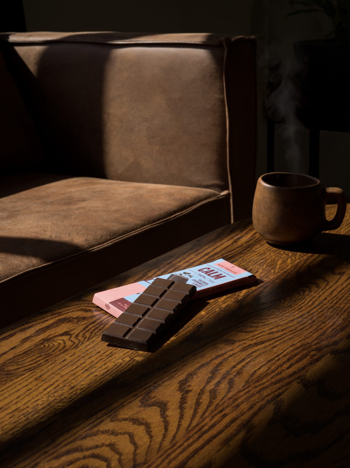
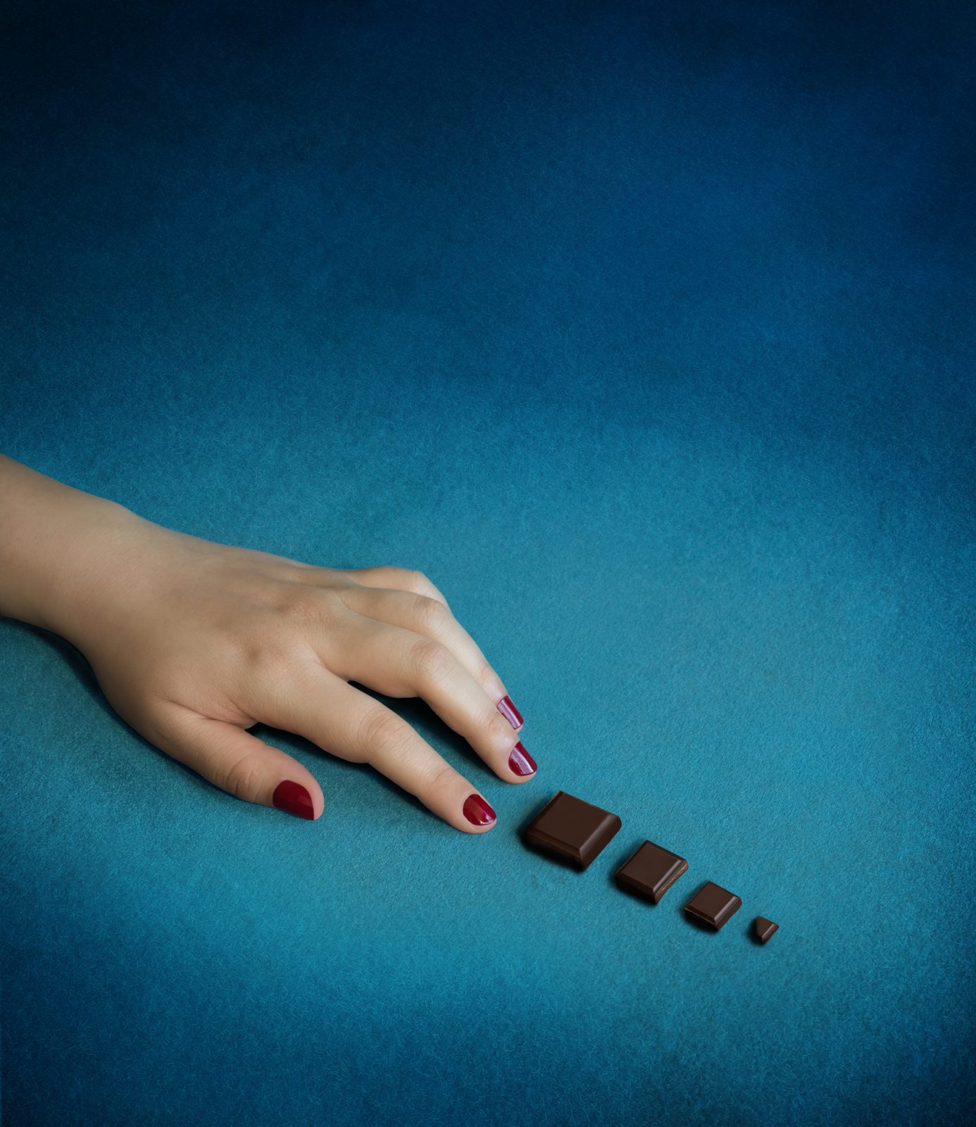
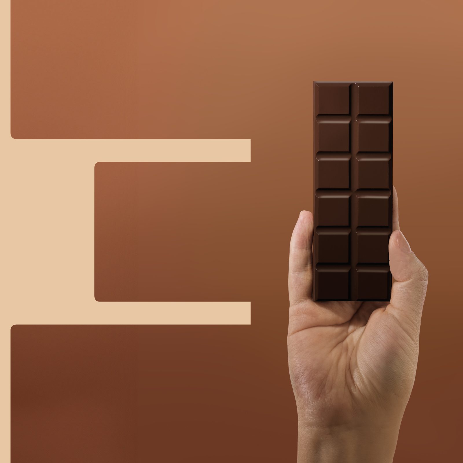
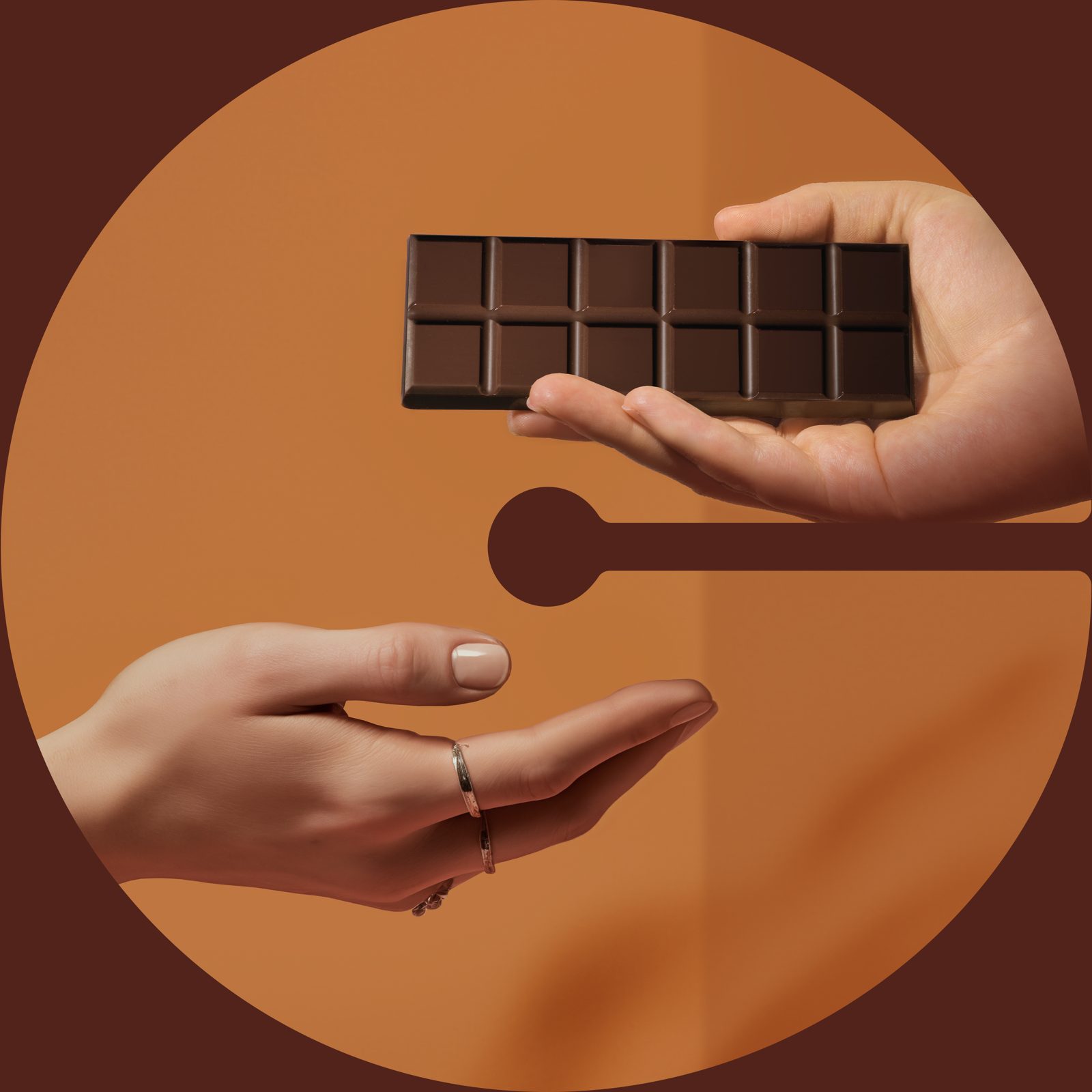
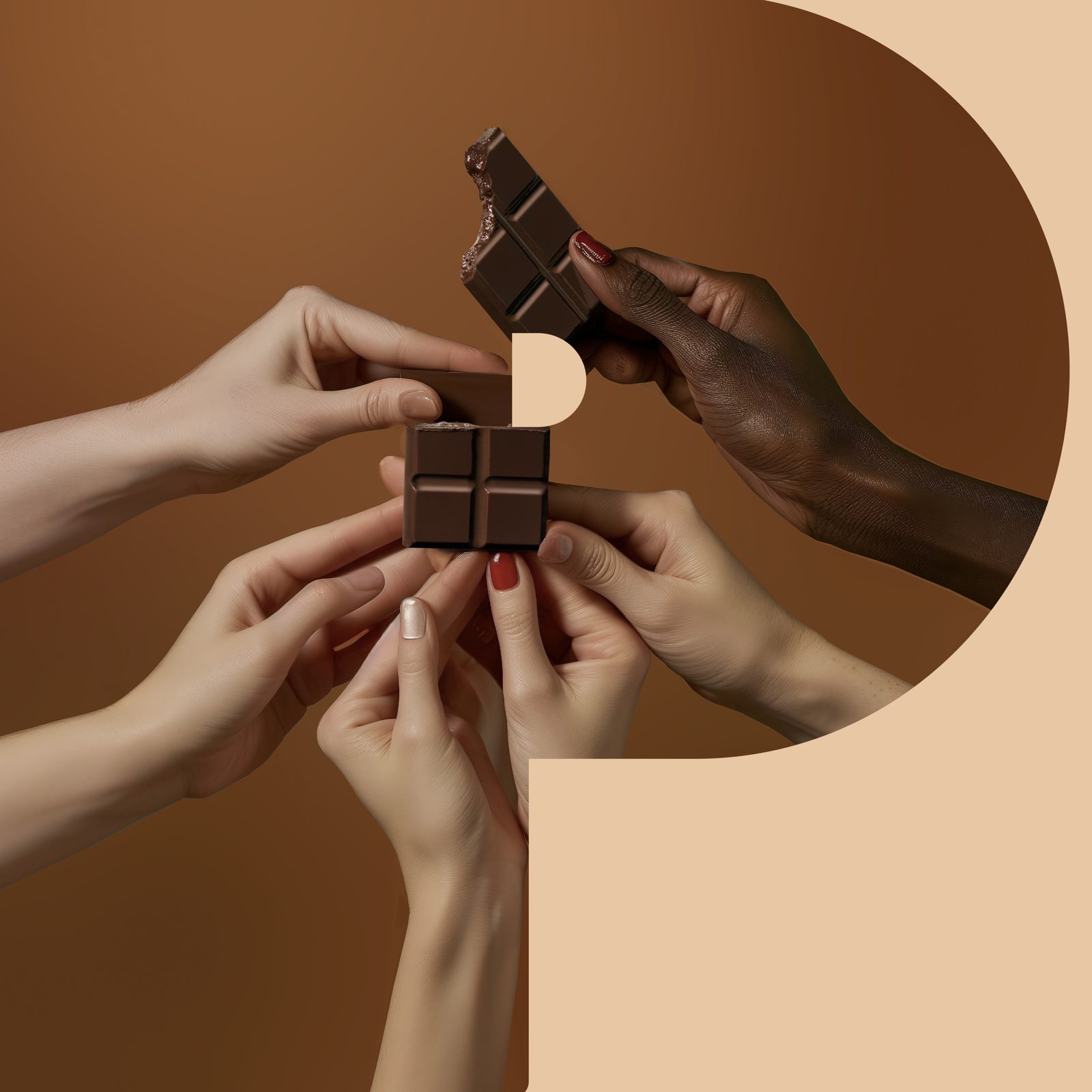
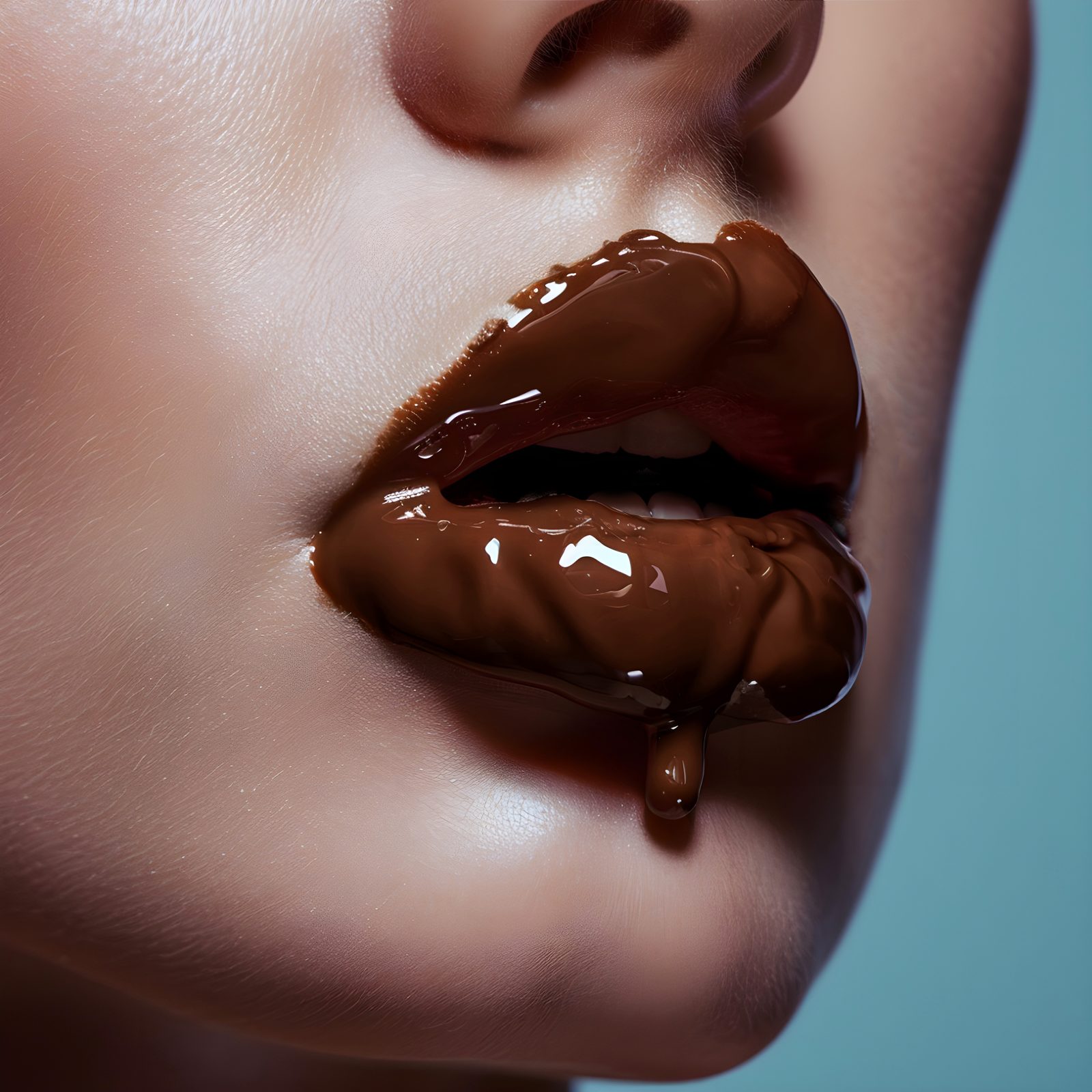
The teaser posts played with waiting, cravings and small emergencies, with headlines that sound like inside jokes. The images mix AI generation, real photography and a lot of Photoshop. When we started, AI was far less advanced than it is now, so much of the craft happened in retouching. Everything was art-directed to one palette: warm browns, vintage sets and a touch of the absurd.



Carousel
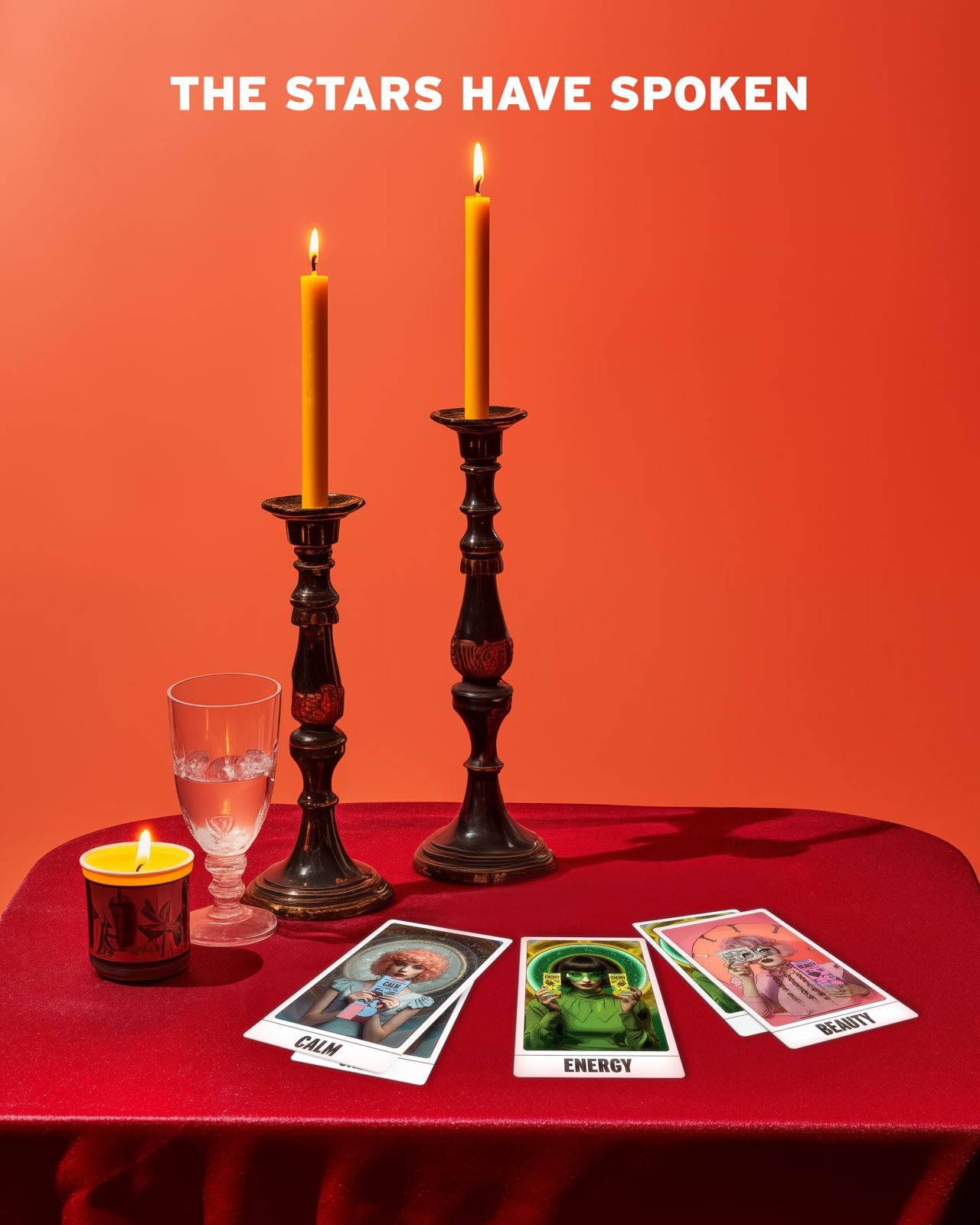
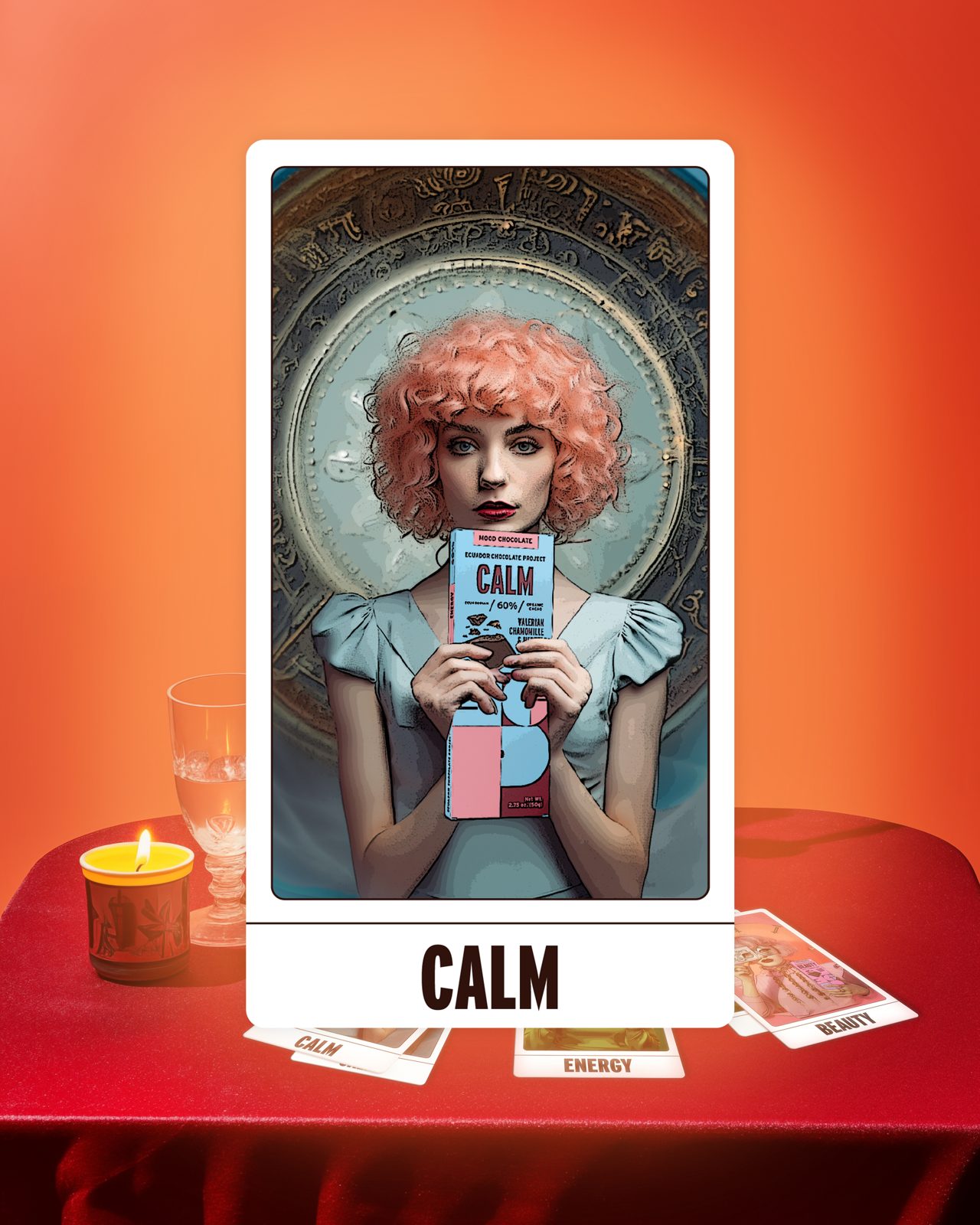
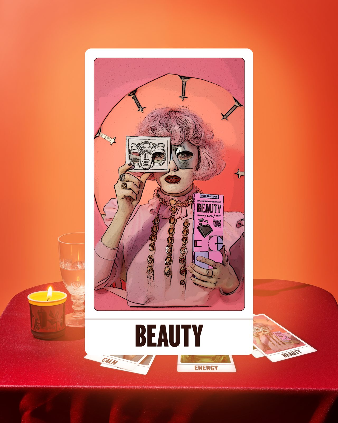
The stars have spoken.
A tarot reading where each card is a mood. Swipe to find yours: Calm, Beauty or Energy.
Farm to bar
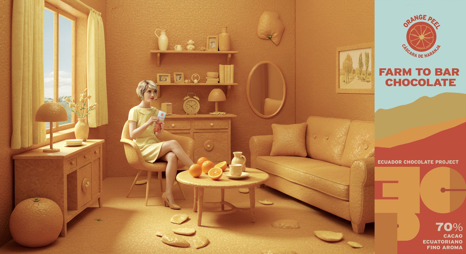
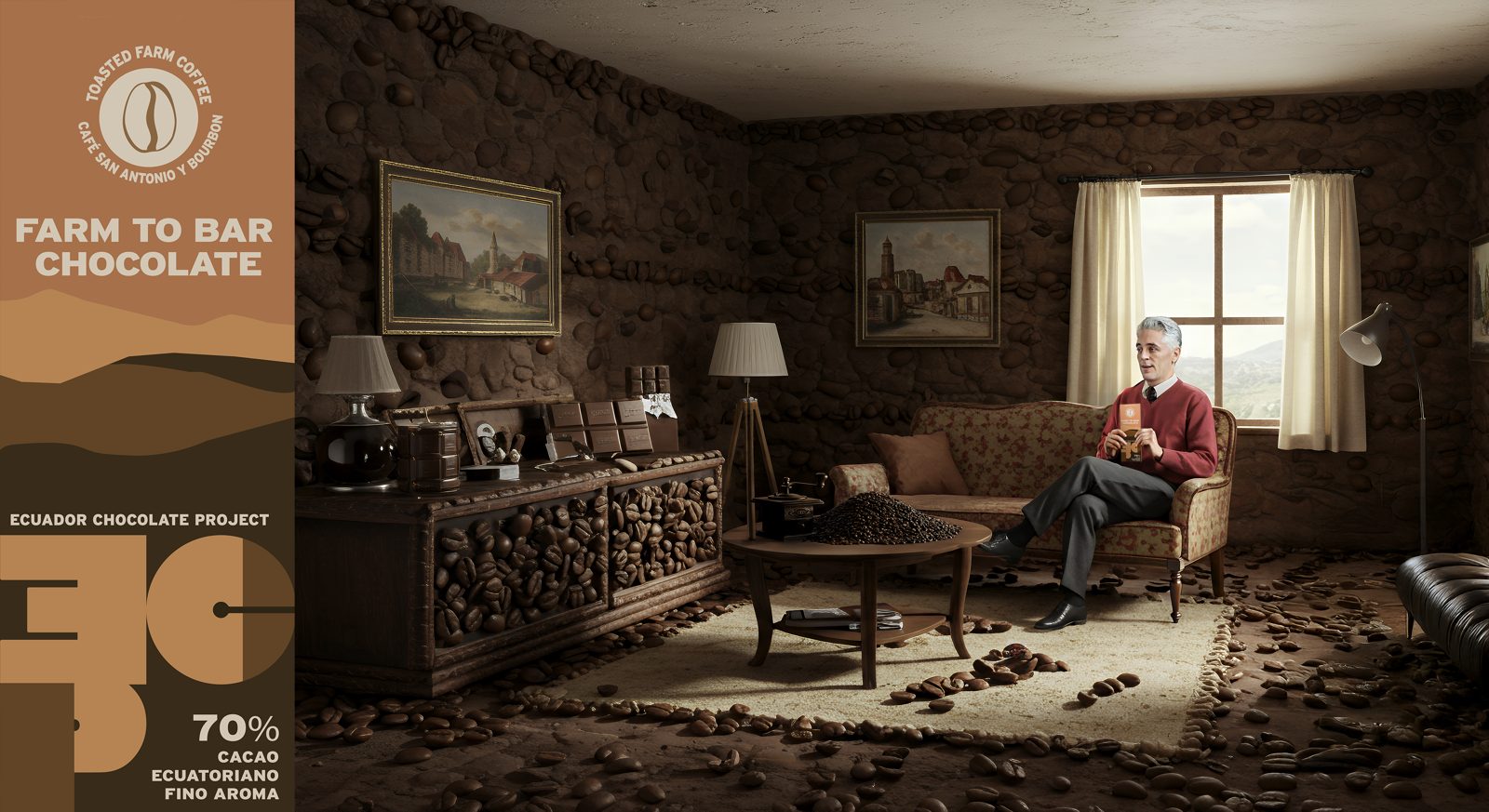
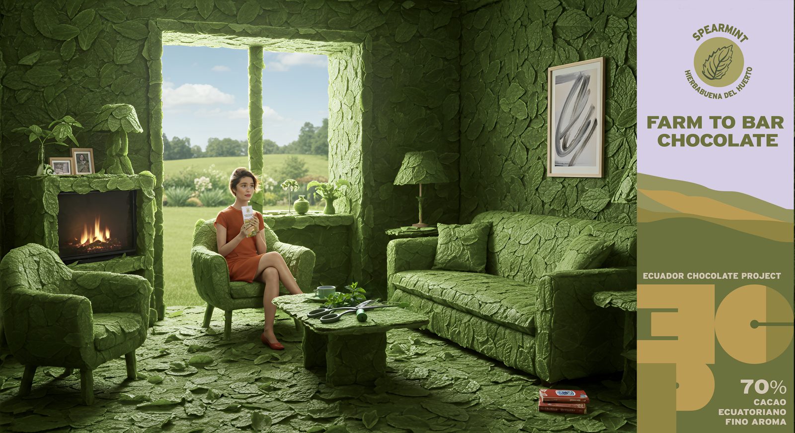
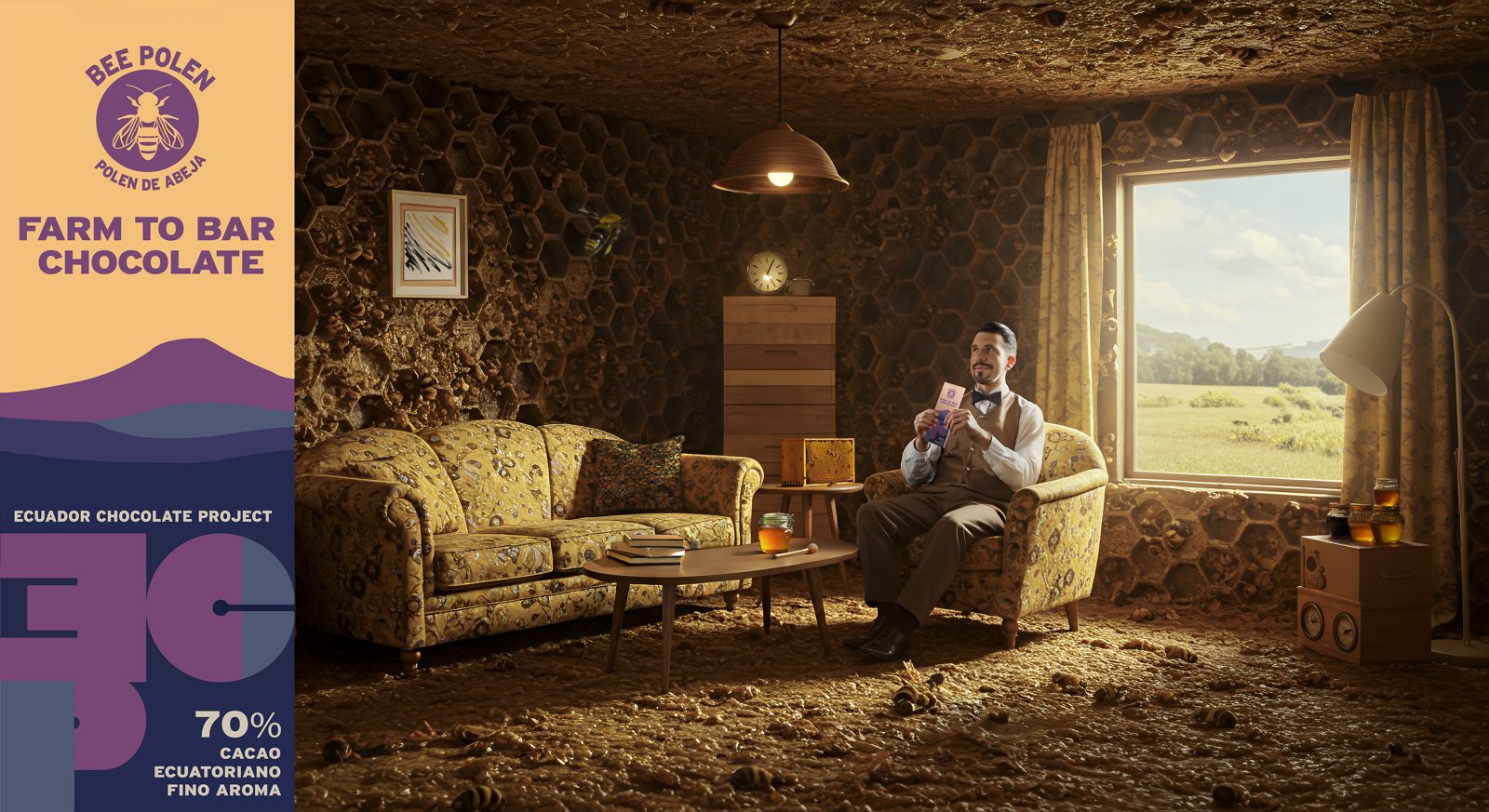
Every ingredient gets its own room.
For the 70% bars, each flavor became a whole set dressed in its ingredient: orange peel, coffee, spearmint and bee pollen.